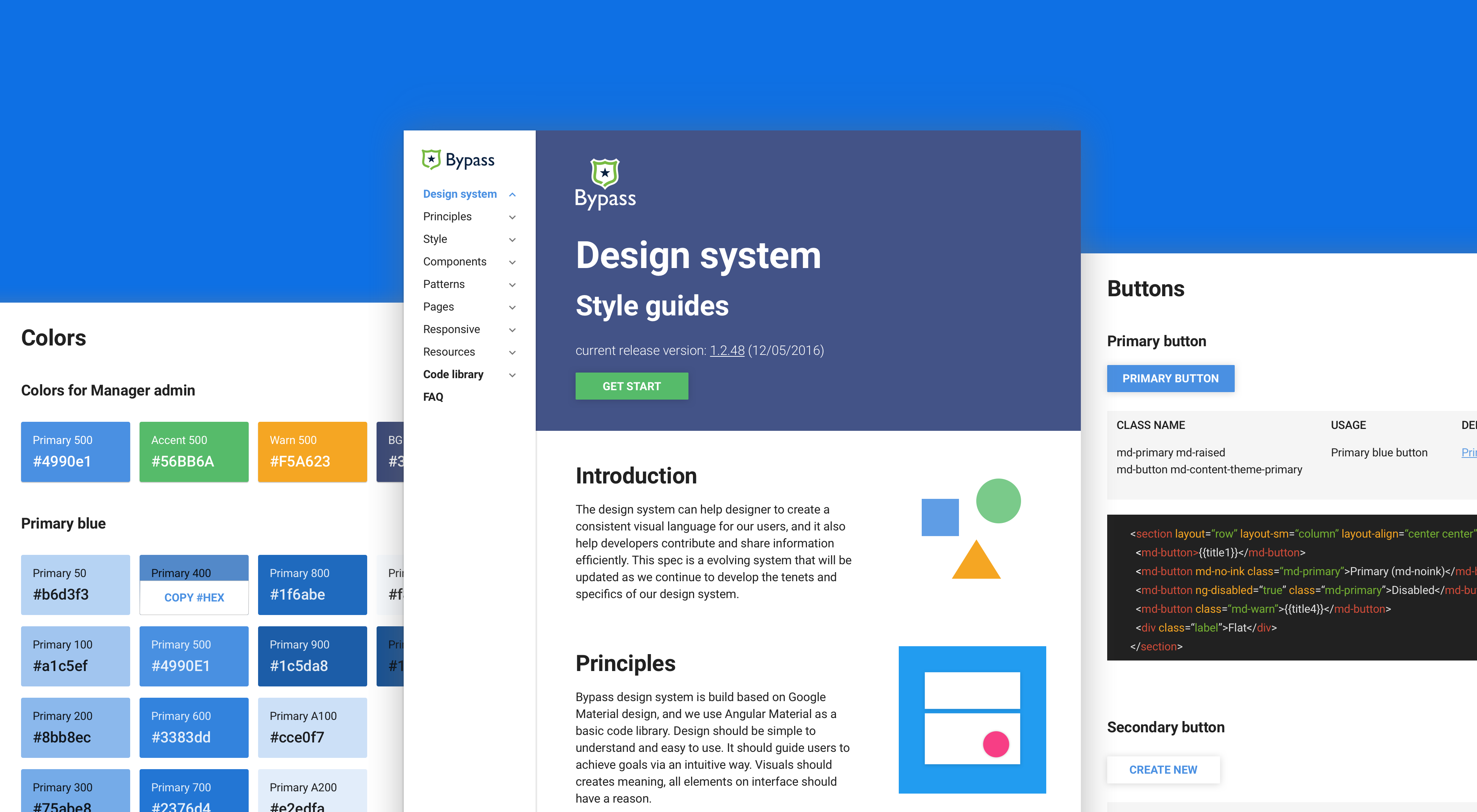
Back in early 2014, when I just joined Bypass, there were tons of inconsistency across the board. We wasted a lot of time debating design details, just because there were no solid rules for our product. These inconsistencies also brought bad experience to our users: they caused confusion and made it harder to understand and learn the system.
1. Coordinator: Talk to people and balancing design pattern across the board.
2. Rule maker: Cooperate with my team members to make rules for entire product.
3. Components creator: Build global components library with my front-end buddy.
1.50 shades of grey: There were many UI inconsistencies across the system.
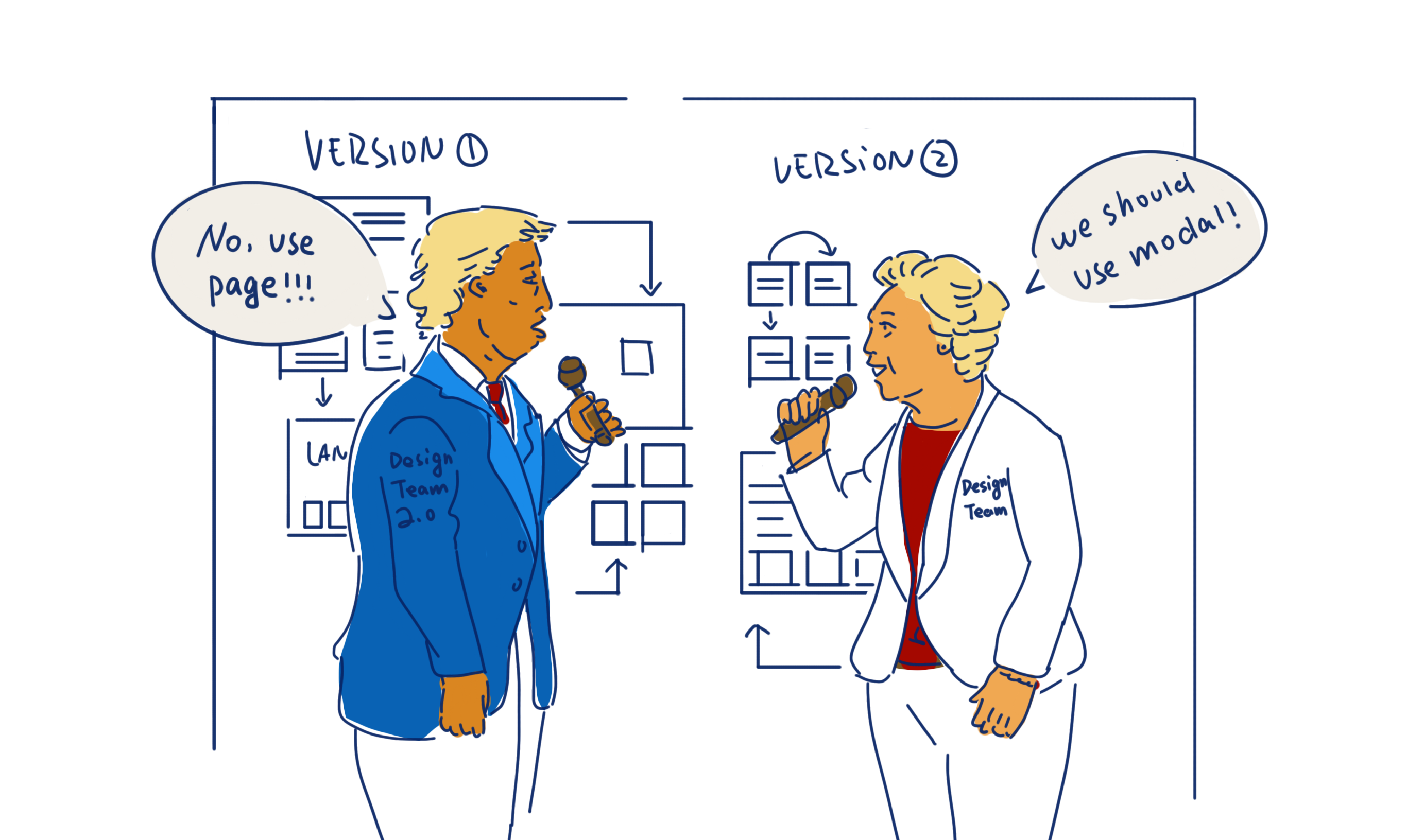
2.Lack of rules: It was easy for us to get bogged down with the details. Even simple questions like “Which component should I use?” became very time-consuming to decide on.
3. Poor quality of delivery: The miscommunication between different teams led UI bugs.
4.Inconsistent code library: Because there was no rule, developers sometimes came up with new components with a different style instead of reuse the old ones, and this further complicated the code library.
5. User confusion: Our users needed a logic path to study the product and build a mental model about it. However, the inconsistencies we had made them confused and frustrated when they could not get their expected feedback.
To solve the problems we had, we decide to build a design system. My job is to design a design system that can balance consistency, creativity, user experience(usability), product goals and technology.
I talk to designers, PMs and developers to make a balanced design system: not too harsh in principle and design pattern, and leave some room for designers to use their creativities, and design user friendly products.
On the other hand, I dive into details to keep consistent UI and interactions across the board. It can save designers from meaningless debate. And it can also reduce inconsistency and make developers' life much easier, at the same time, achieve product goals much faster.
If design is an art of compromise, then designing a design system is the concentrate.
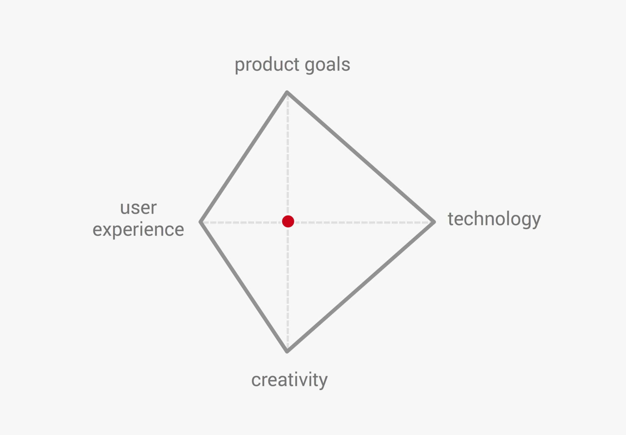
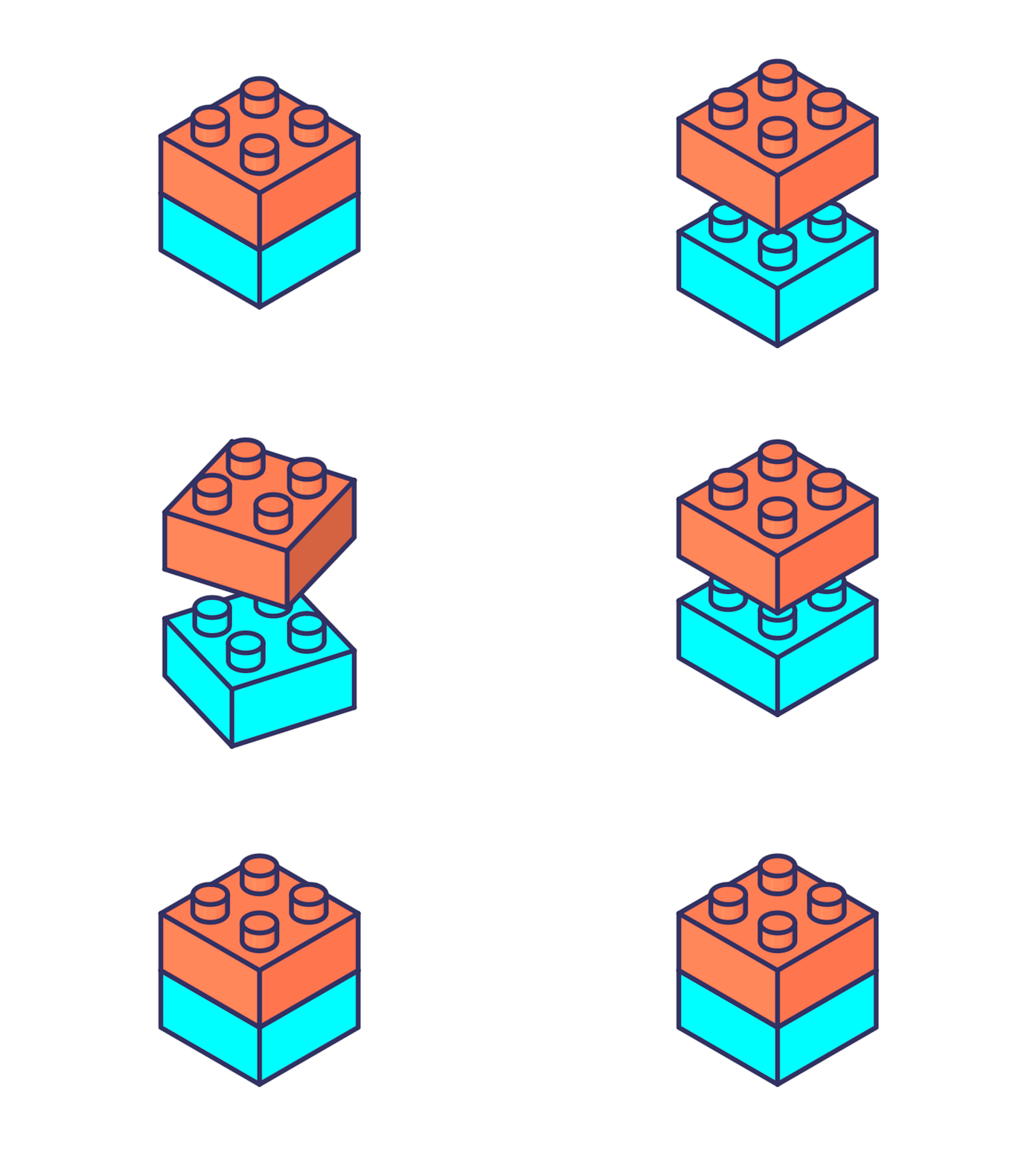
image credit: Fabricio Rosa Marques
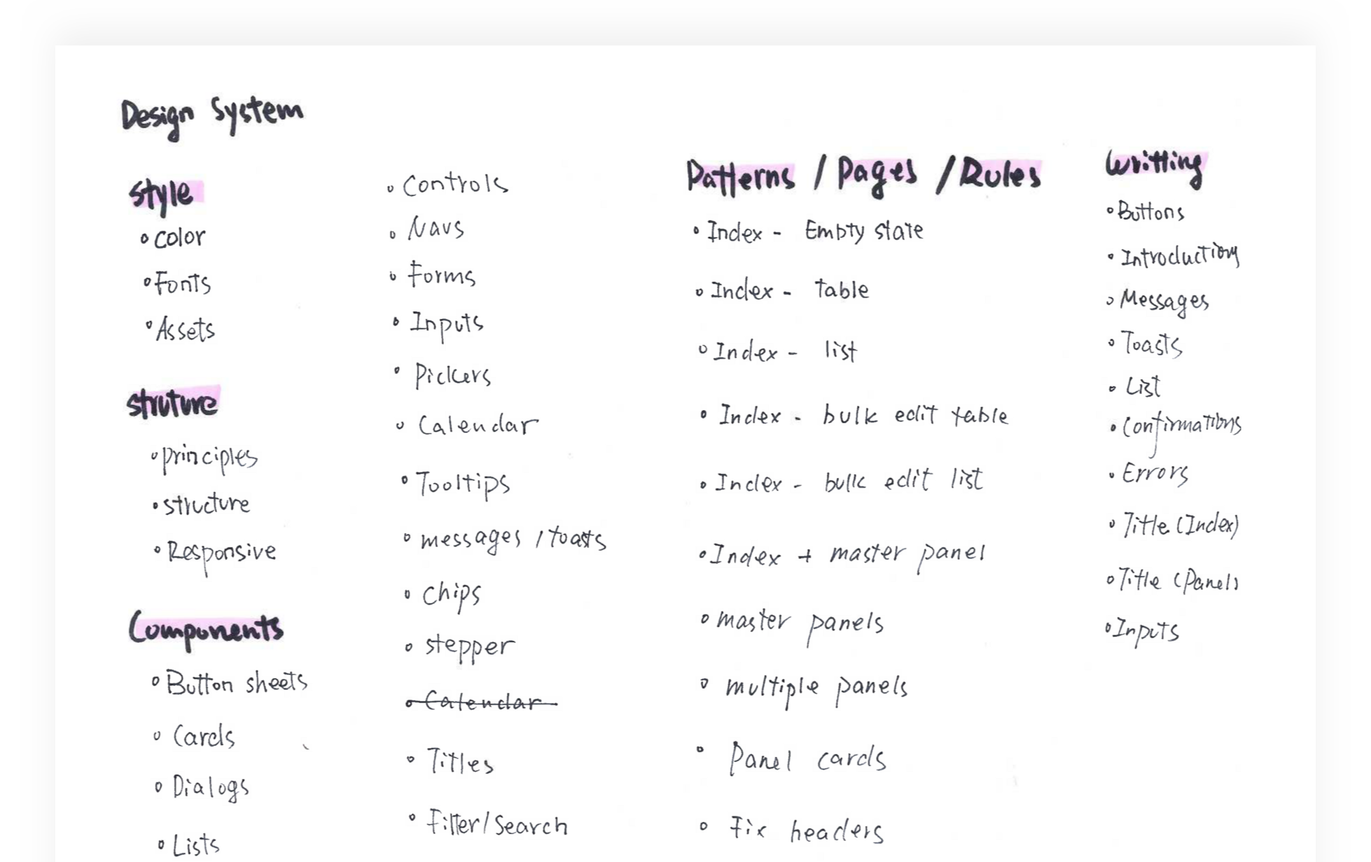
Style guides (with shared design resources)
A style guide is the infrastructure of the design system, it can help us keep UI consistency, just like different basic pieces of LEGO. And attach a Sketch file that contains all atomic pieces, and allow all designers access to will make them life easier.
Read my previous article “How to get a head start on design system.” for more details.
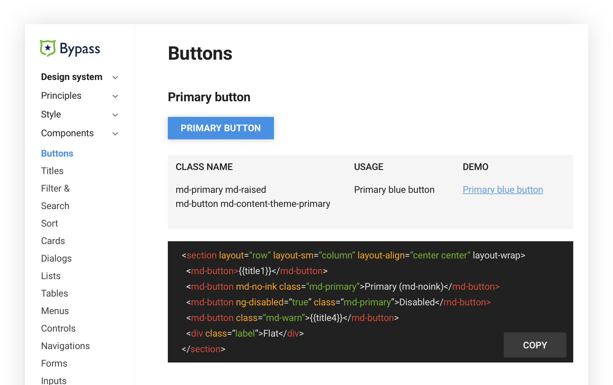
Live component library
It’s an efficient tool for front-end developers to keep consistency, avoid mistakes and speed up the development process.
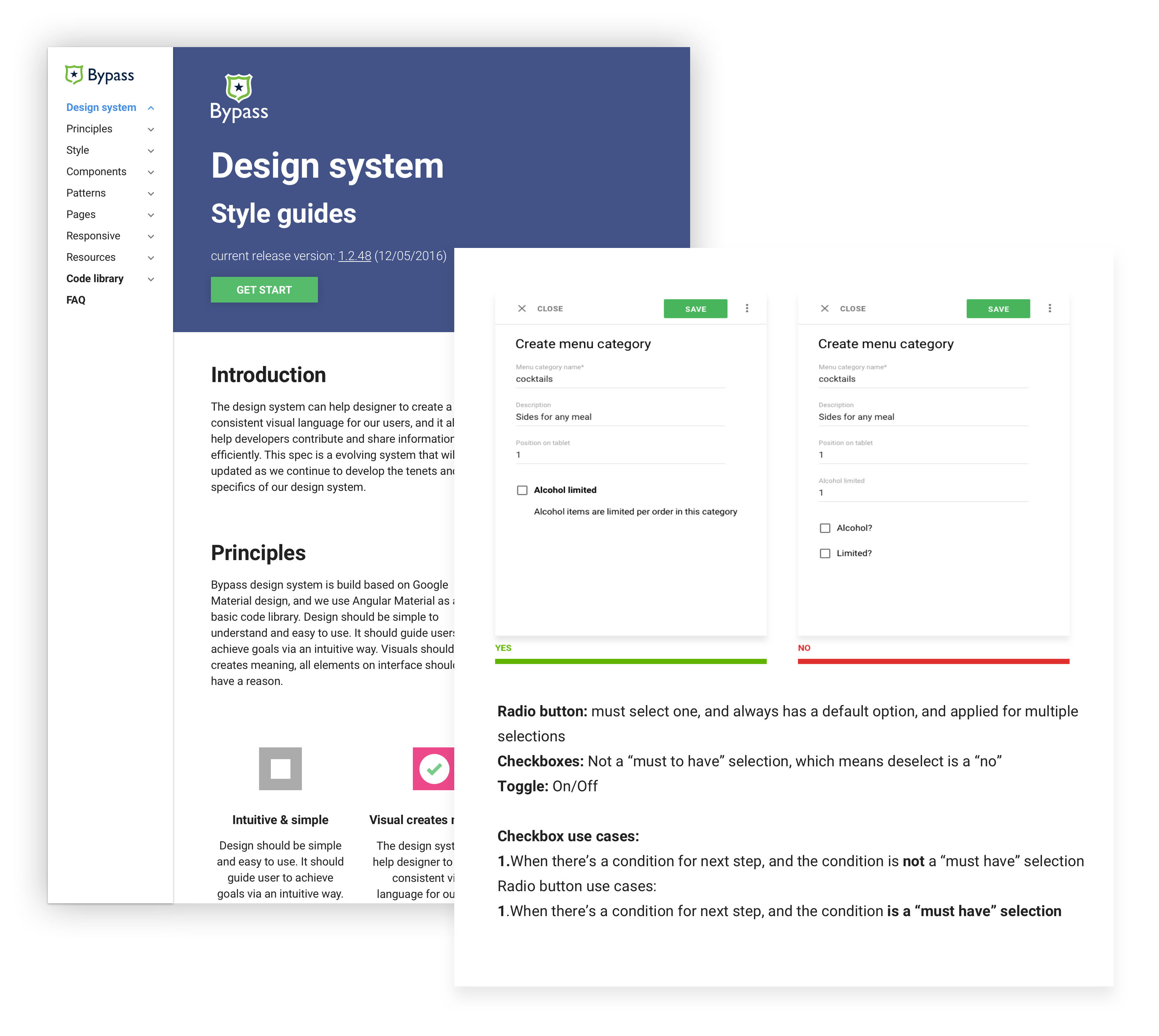
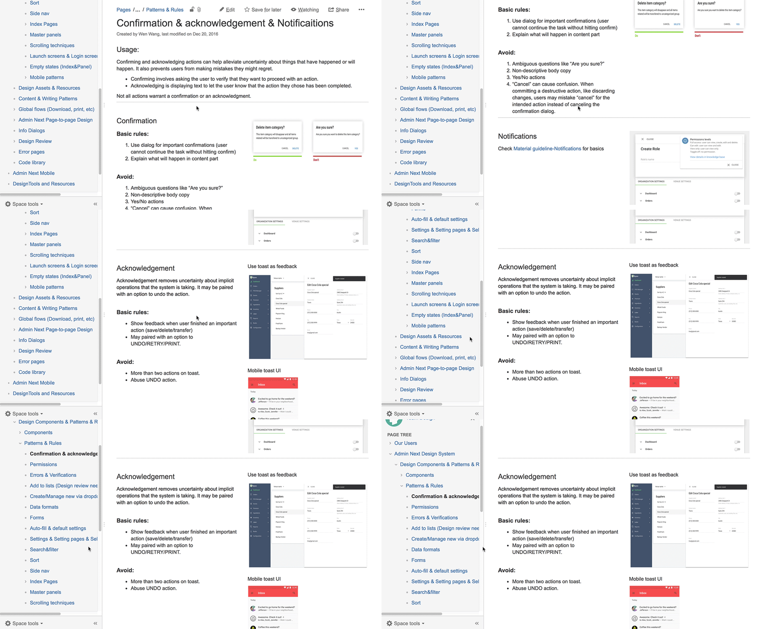
Principles, rules and conceptual models
Principles, rules and conceptual models are explaining how are the design pattern works in product. And helping designers have a clear mental modal about how things work in product level. It can contains global interactions, design patterns and global principles for the product.
To help users to discover and learn about the complex product, I design interfaces that provide context and information in proper ways.
I design logical and understandable interfaces for the users that already know how things work in the game and entertainment industry. Users can see, and understand what the interfaces are for. My design helps them to develop a better mental model about the process.
I build a design library with my front-end buddies to keep interactions, look and feel consistent across the board. Using a design library is a super effcient way to communicate with developers and hand off my designs. I design interfaces that have consistent feedback and layout across multiple platforms. Users can easily predict what will happen if they execute an action.
*Read more about how I build design library here How To Get A Head Start On Design System
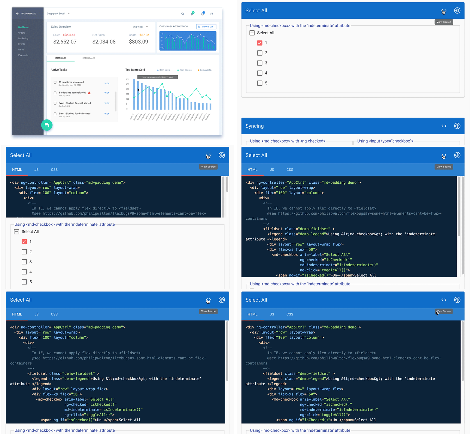
Hand of process example (with Angular Material library )
Smooth hand-off tool
As the company grows, cooperation and hand-off work become harder and harder. With the design system, hand-off becomes easily and smoothly. There are three groups of people who can take advantage of it. For QA people, they know what to test, and whether the delivery matches with design rules. For designers, there’s no more debating about global interactions. Also, designers can work on other designers’ design file without any confusion. For developers, they can understand design files clearly, and build them out in a proper way.
Quality delivery, consistent UI & expectation
Thanks to the consistent components and design rules, we get high quality outcomes across the board. For our users, it’s easier for them to learn and operate. Now they can study the system pretty easily and get their expected feedback every time.