Menu builder is one of the biggest redesign projects I am in charge of at Bypass Mobile. It cost 6 months for my team to do research, design ,test and iterate. The goal of the redesign is to help our users to get their job done faster and smoother, which in turn makes their lives much easier.
1. Researcher: I interview users and gather feedbacks about current menu building process. I analyze support tickets and data to drive design decisions. I dig deeply into users' real needs behind the scene.
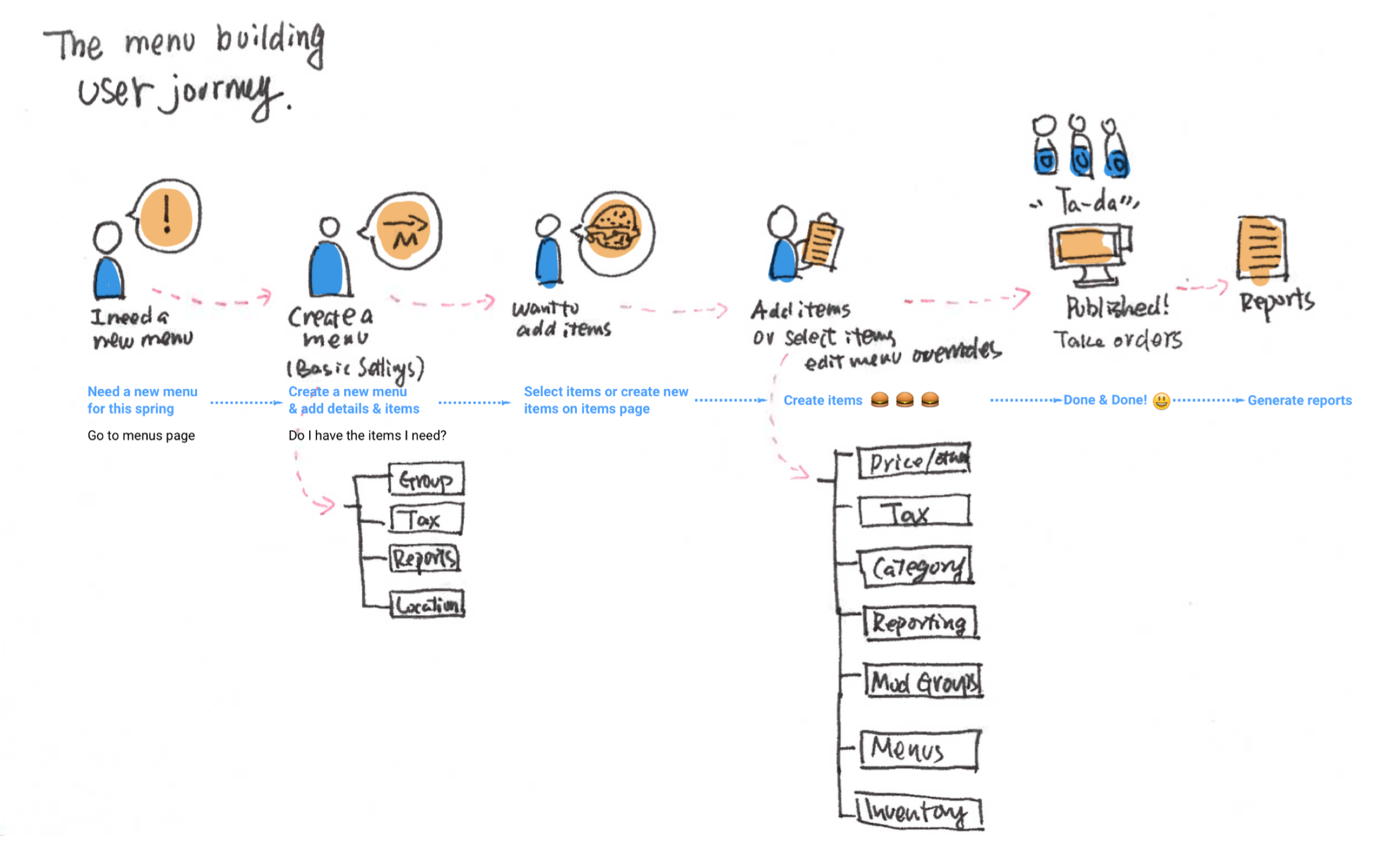
2. UX Designer: I cooperate with other team members to utilize the research results and bring conceptual ideas and solutions. We reconstruct the information architecture, redesign user journey, and build an efficient tool to help our users to achieve their goals.
To help our users to finish their tasks, even if they don’t have ‘all the pieces’ ready.
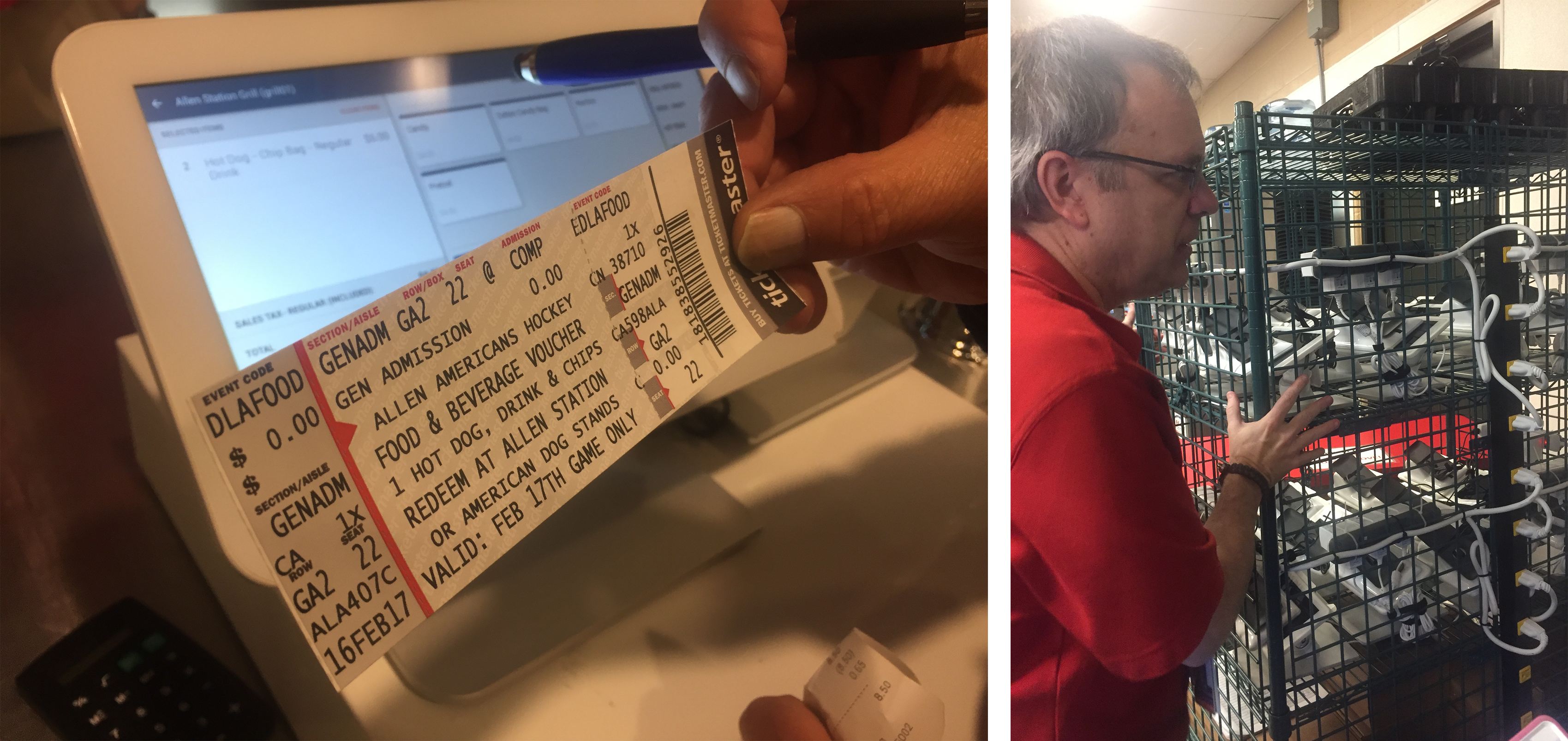
Shadowing the real users on site is always fun and very valuable. I can get more feedbacks than I expected. For example, the guy in the right image. We talked about our products almost all day long and I was surprised by the way he operated our product - it was way more efficient than I thought, which gave me a lot of inspirations.
Example questions:
We also try to define users' psychological feeling in the user journey.
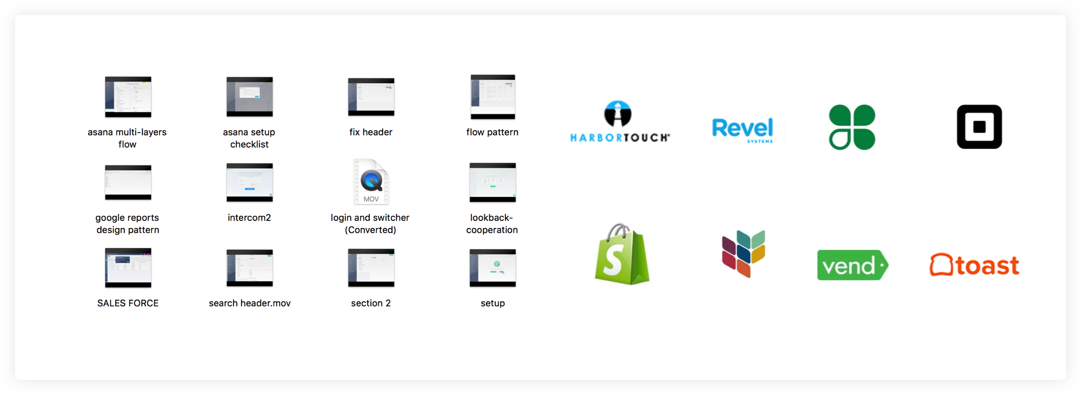
To compare various solutions, I did a lot of research about how other products solve similar problems. SquareUp and Shopify are two products that give me a lot of inspirations. Also, some products that are not related to the industry are valuable. The design patterns they use can often enlighten us in coming up with our own solutions, such as Google Tag master and Stripe.
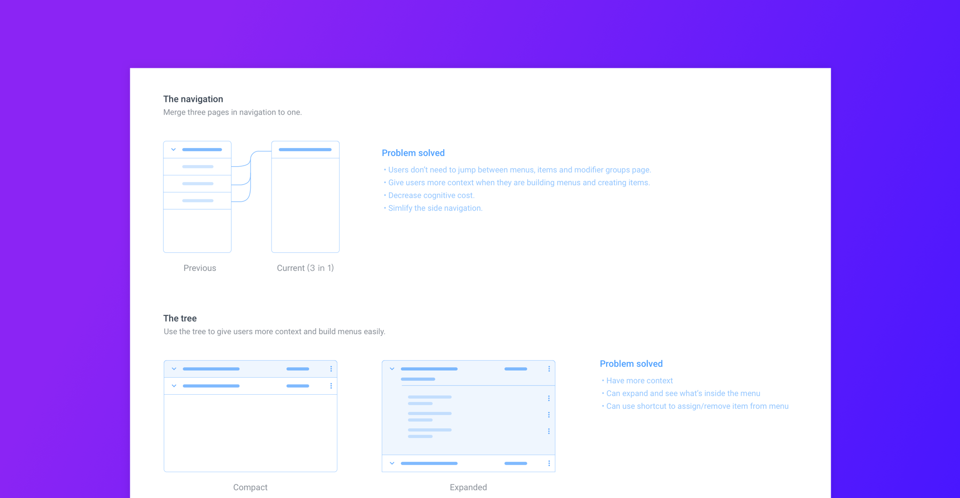
I cooperated with the PM and the product lead to shuffle our old information architecture and reorganized it into a more reasonable structure. We built a new user journey based on that, and redesigned design patterns to make it smoother and more user-friendly.
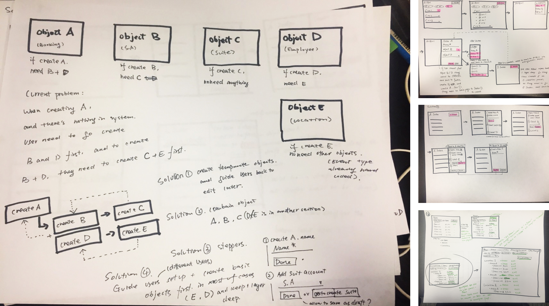
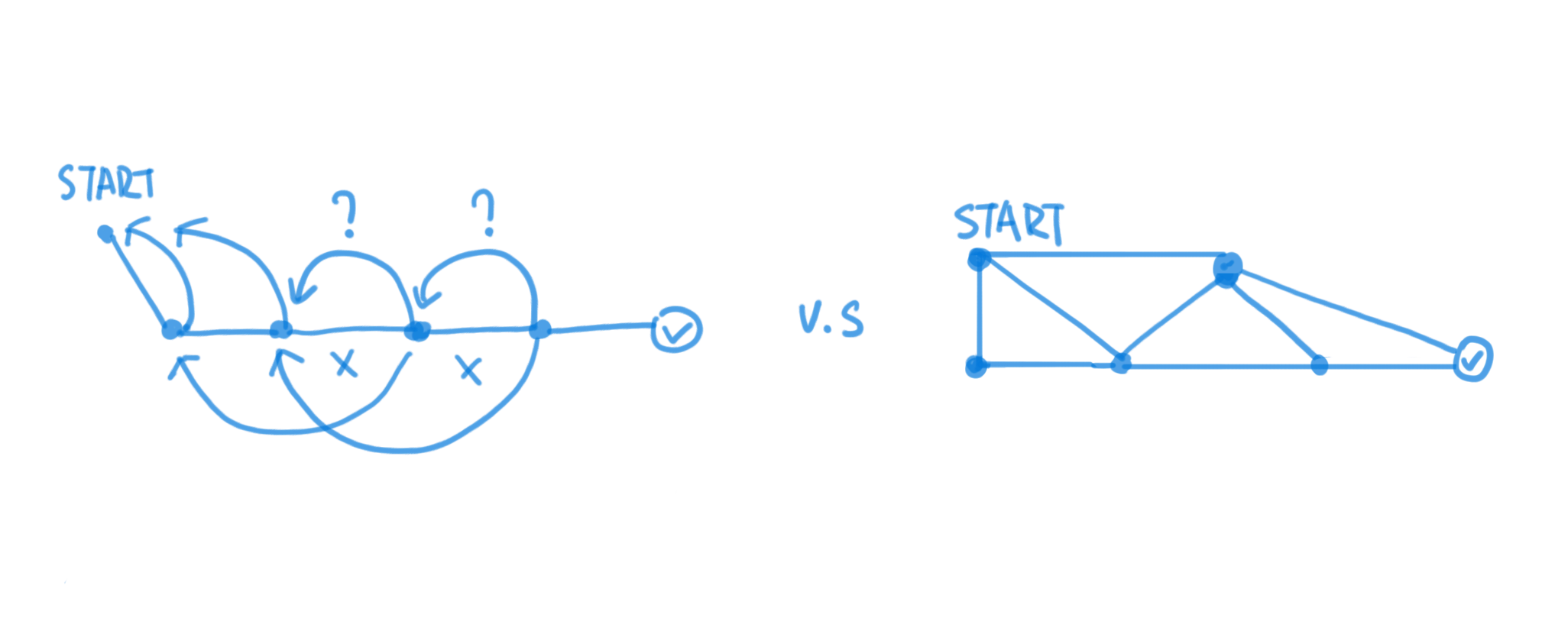
We start to analyze how many jumps users need to make, in order to build a comprehensive menu (5-10 items and 1-2 categories).
We separate our users into different groups: fully trained, mid-trained and new users. We try to remove the "roadblocks" from the paths that users want to go through, and make the product more forgiving and friendly for less-trained users.
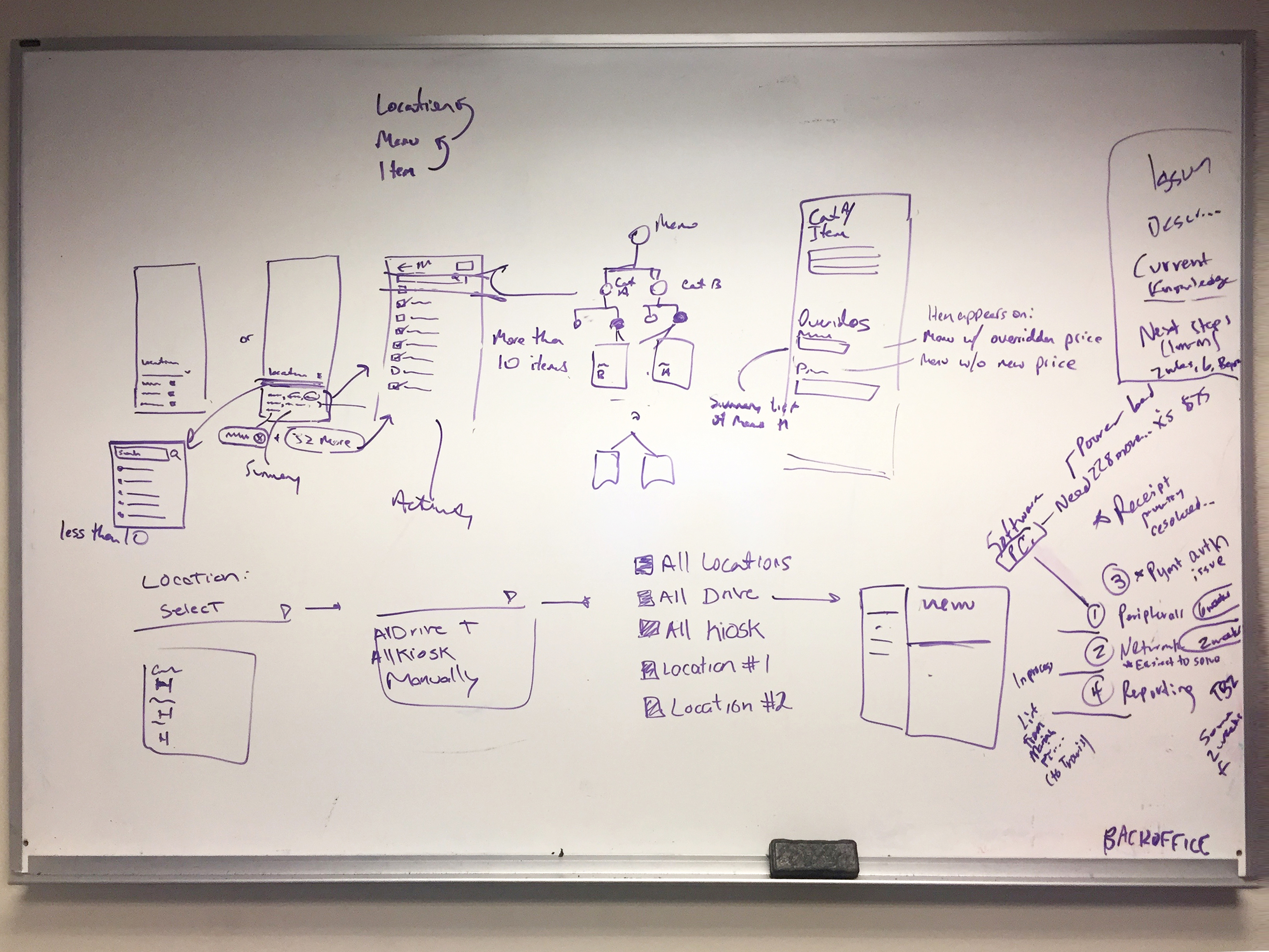
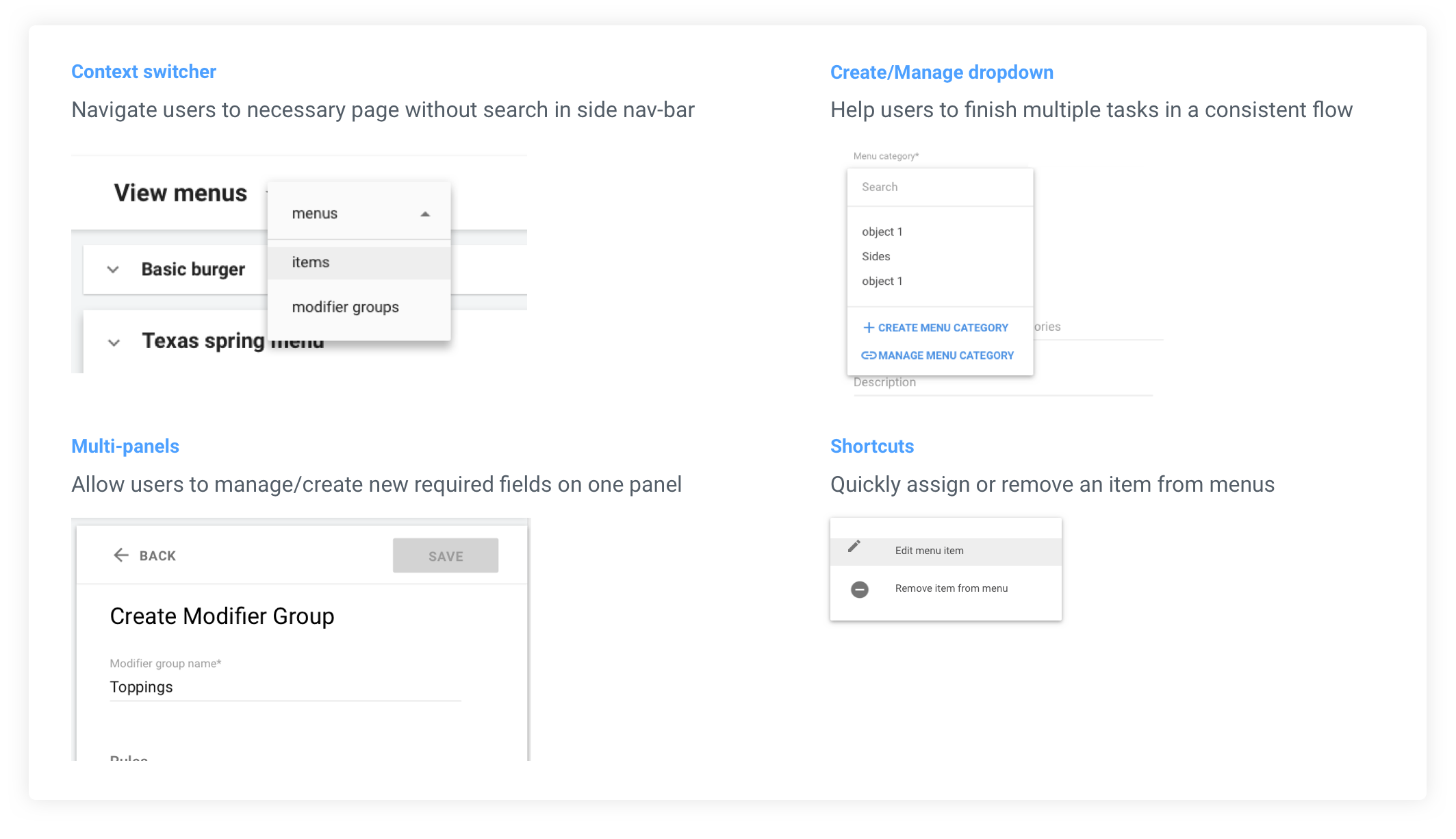
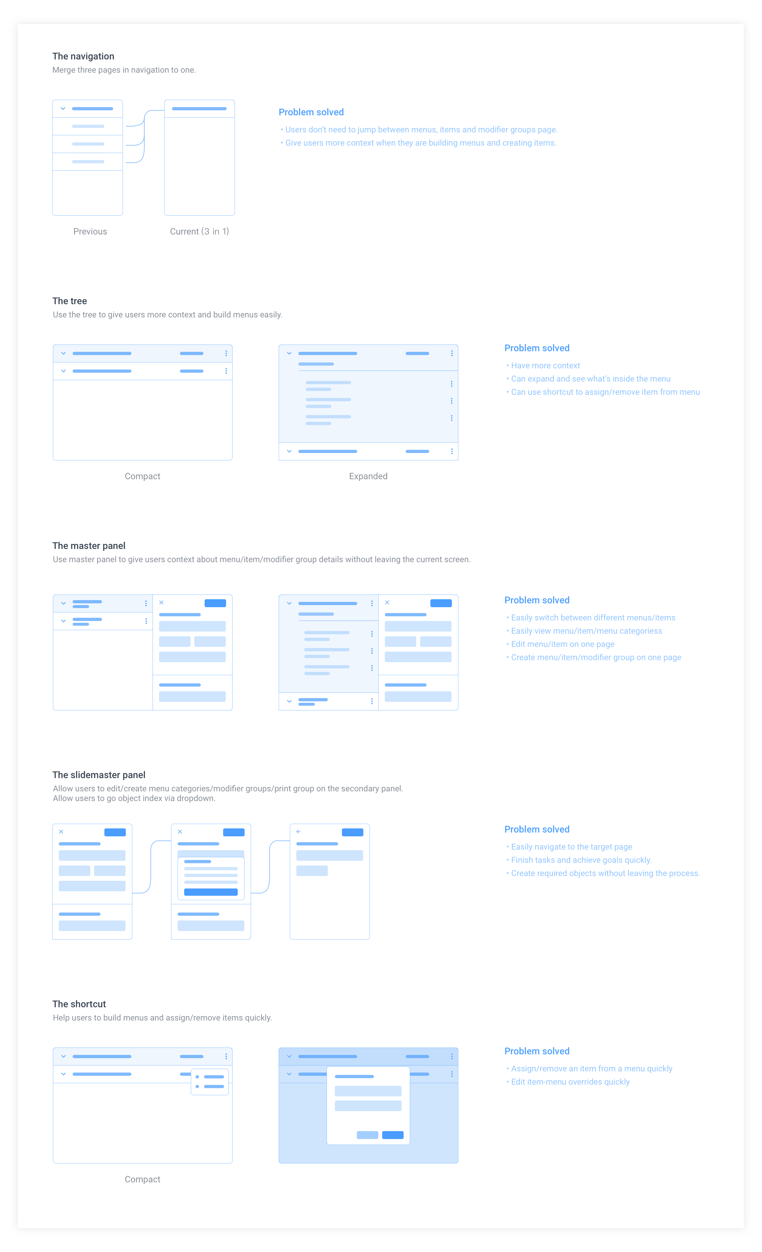
To decrease the cognitive cost and give users more context to get the information they need easily, I redesigned the flows based on our new design system. The chart below is showing some basic design patterns I came up with for the menu builder, and what problems are solved by these patterns.
Support team and PMs always give me valuable feedbacks. Support staff are the ones who understand our users deeply. They know all the drama from real users: they have been yelled at by stressed users, and be thanked by happy users as well. As a designer, I consider them as my close design partner and also my "Beta users" for the very new designs.
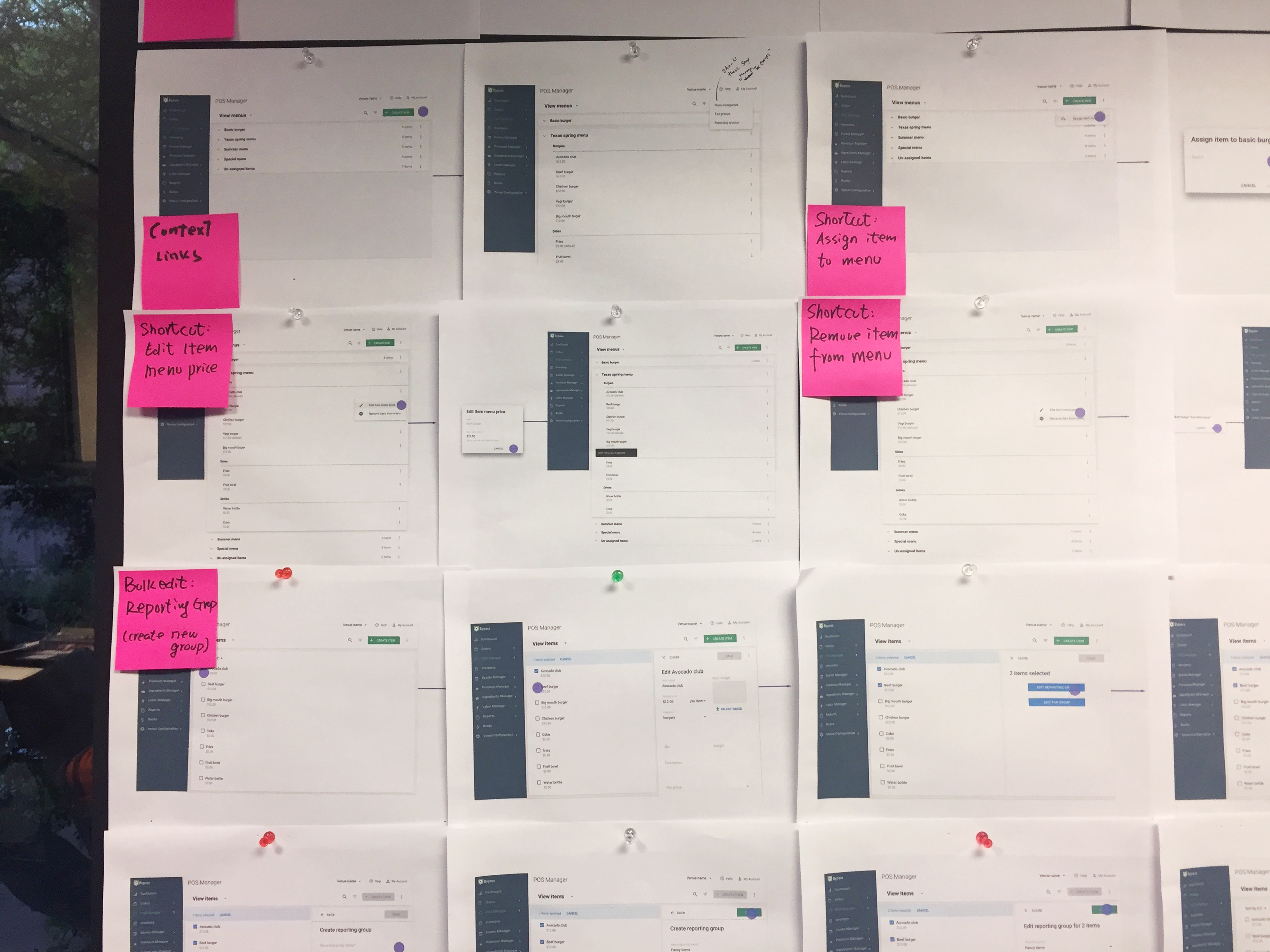
During each step, we do make lots of design decisions to move forward. User testing is one of the ways that can help us to make decisions about micro-interactions and design patterns.
We usually run internal testing with different groups of users.
Here I'll summarize some main user experience improvements of the redesigned menu builder. Below you can see how it helps our users get their job done faster and easier, while also increasing task success rate and users' happiness.
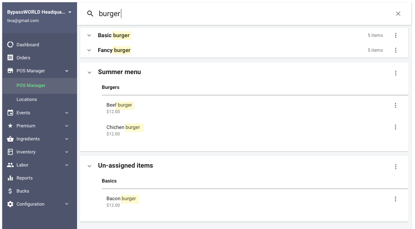
A new and better search system that supports menu and item search.
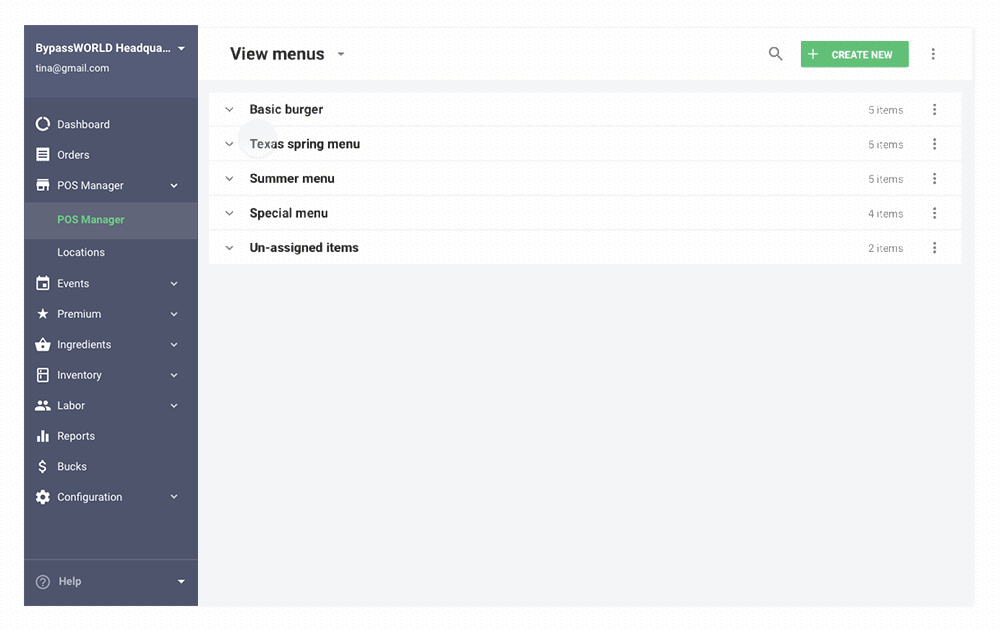
Giving user more context and information of menus. Allow users to easily expand and collapse a menu. Allow users to view and edit menus and items easily. Help them to build a clear mental model of the menus, items and modifier groups.

Allow users to understand what's inside a menu, review menu and item details settings. Allow users to quickly edit without leaving context.
Content Switcher can help users switch between menus, items, and modifier groups index.
Create/manage in dropdown can help the user create the required content when it does not exist.
Multiple panels can help users manage different objects in one place.
Shortcuts can help users assign/remove items quickly.
The designs can help users finish multiple tasks and achieve their goals in a happy path.