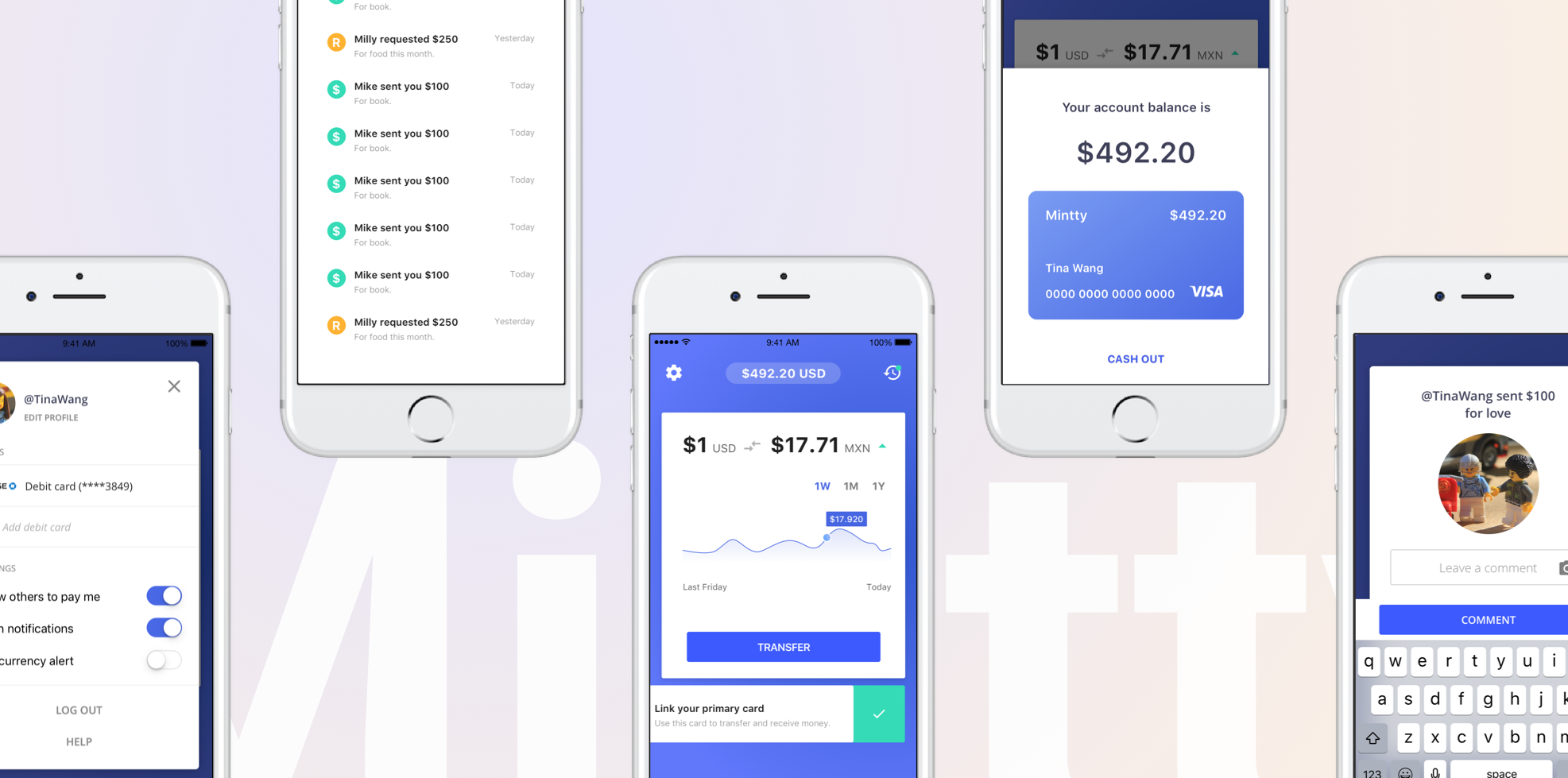
Mintty helps people to transfer money across the world in a faster, easier and cheaper way. Foreigners who work in the U.S can transfer money to their families, and foreign students can get money from their families in other countries.
Up until Oct 2017, I led efforts to evolve the user experience. I also led user research to interview, test, and gather feedback from our end users. And participate in product strategy, interactive flow, and visual design.
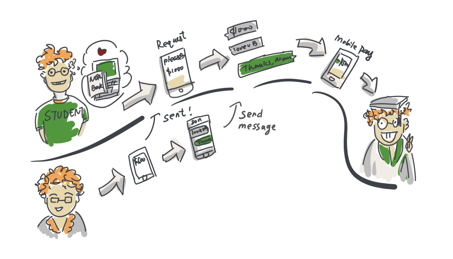
To help our users to transfer money abroad easily.
People who work in US and want to sent money to their family in a foreign country
Students who request/receive money from their families
*People who have foreign bank accounts, and want to transfer money between them
A safe, efficient and cheap way to transfer money abroad.
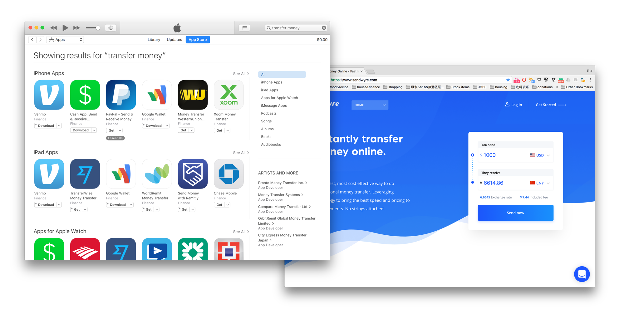
By exploring and compare similar products, we get lots of inspirations that not only from UX/UI perspective but also product strategy and the product's direction. Square Cash and Wyre are two great products that give me a lot of inspirations. The design patterns and product strategy they use can often enlighten me in coming up with our own solutions. For example, Square cash bring a great user experience to users who don't have a fully functional banking system. The users they are servicing are desiring to get cash immediately, and many of them don't really have a bank account. It's a perfect example of JTBD design method and user-centered design.
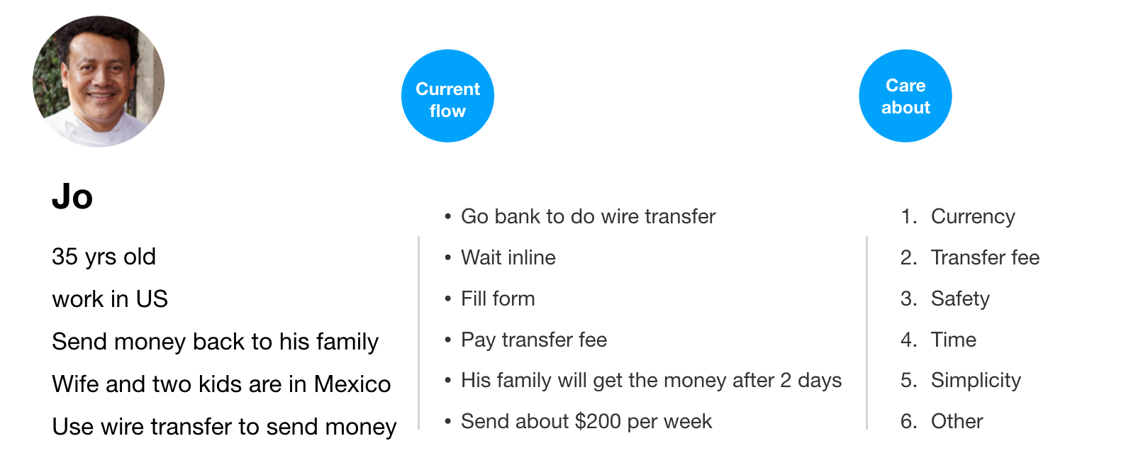
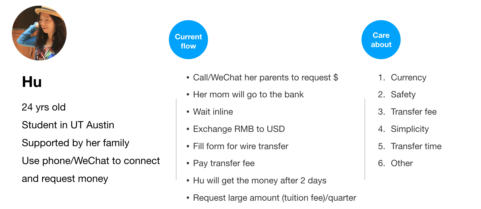
In the early stage, we interviewed and gathered information from our target users. It's an important way to help us define where to go, and what problems to solve. The two sample groups we interviewed with were Mexican workers who support their families in Mexico, and Chinese students who are supported by their families.
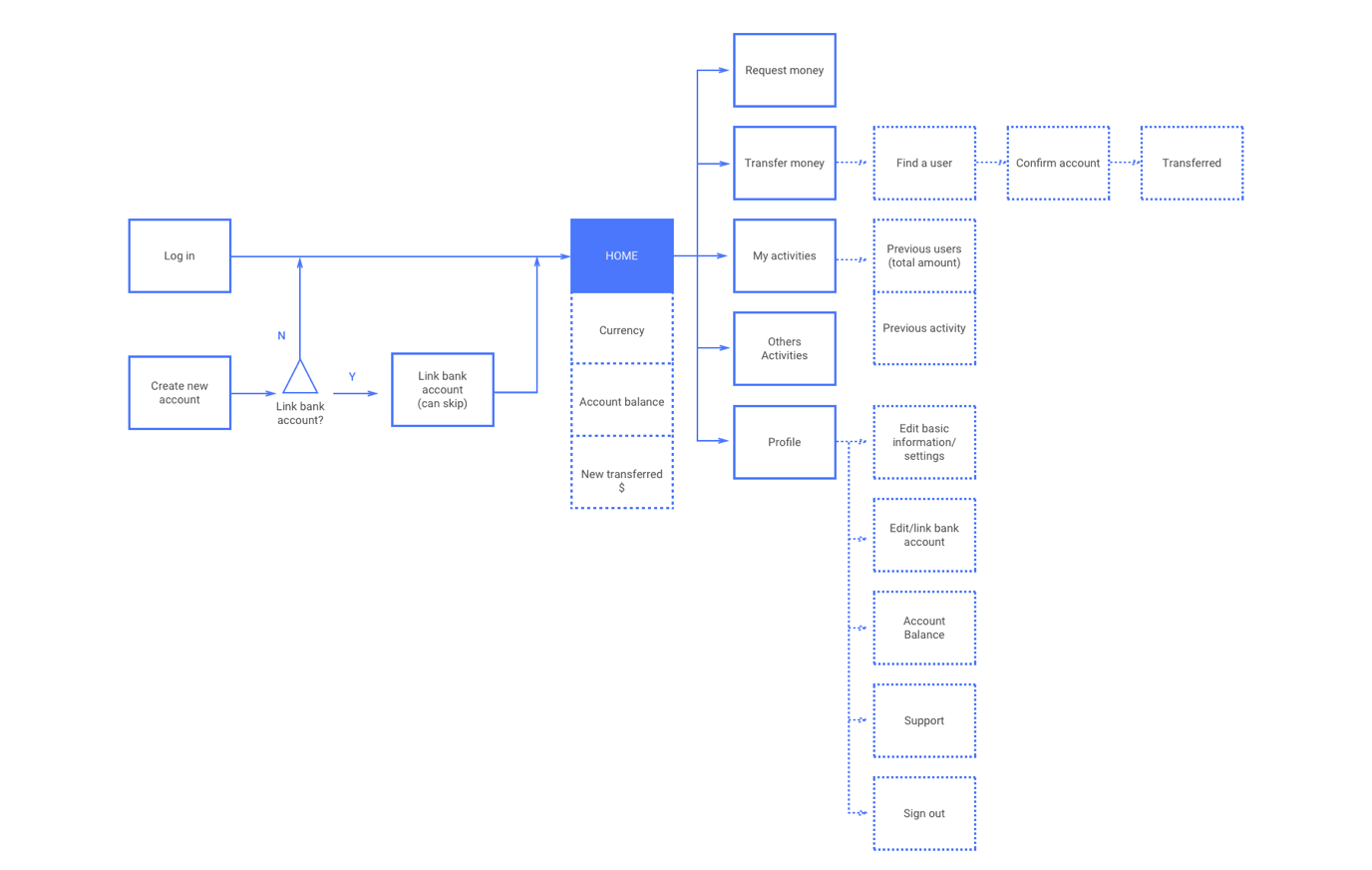
Placing key features into reasonable information structure is the basic to build a logical and seamless product.
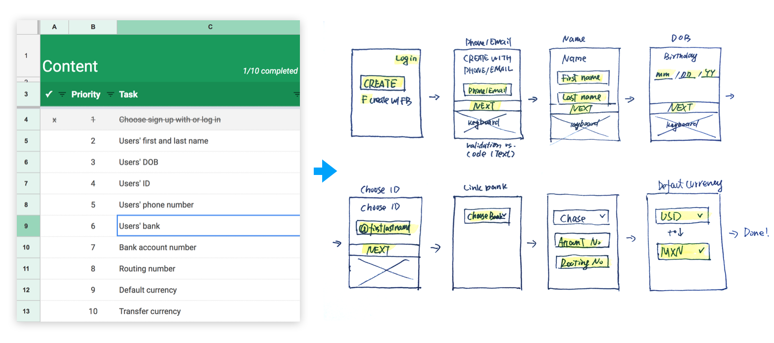
Filling the spread sheet with key elements of each flow/screen, then transfer them into sketchs.
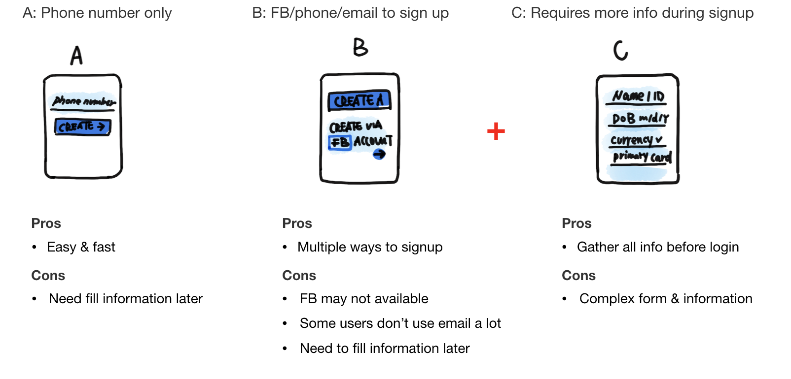
We usually sketch mor than one solutions for a problem, what we do next is to compare the pros and cons of those solutions, and choose the most proper one to build detailed wireframe.
Once we decide to go with one of the solution, the next step is spliting sketches to more detailed wireframes, design delightful user experience.

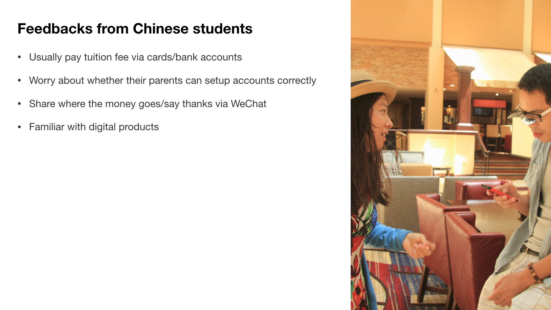
Once we build a functional demo, we bring it to our users and let them to test it. We design tasks for them to finish, ask questions and gather feedbacks to improve our product. The following are conserns and problems from our user.
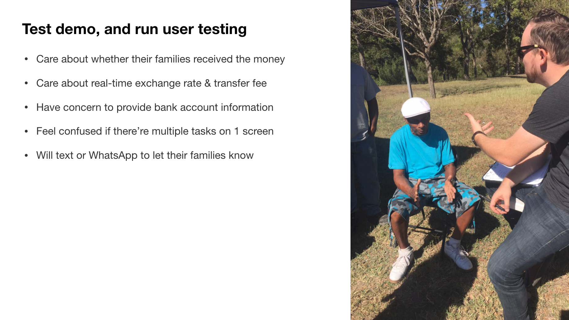
We run the same test between two different user groups, one is Mexican workers, and the other is Chinese students, to understand different user perspectives.
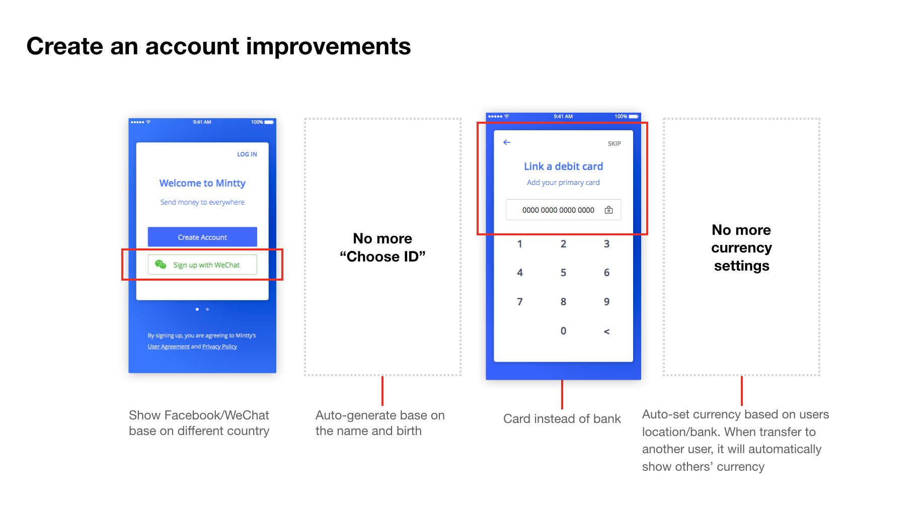
Changes: Allowing users use the most convenient account to sign up base on different countries
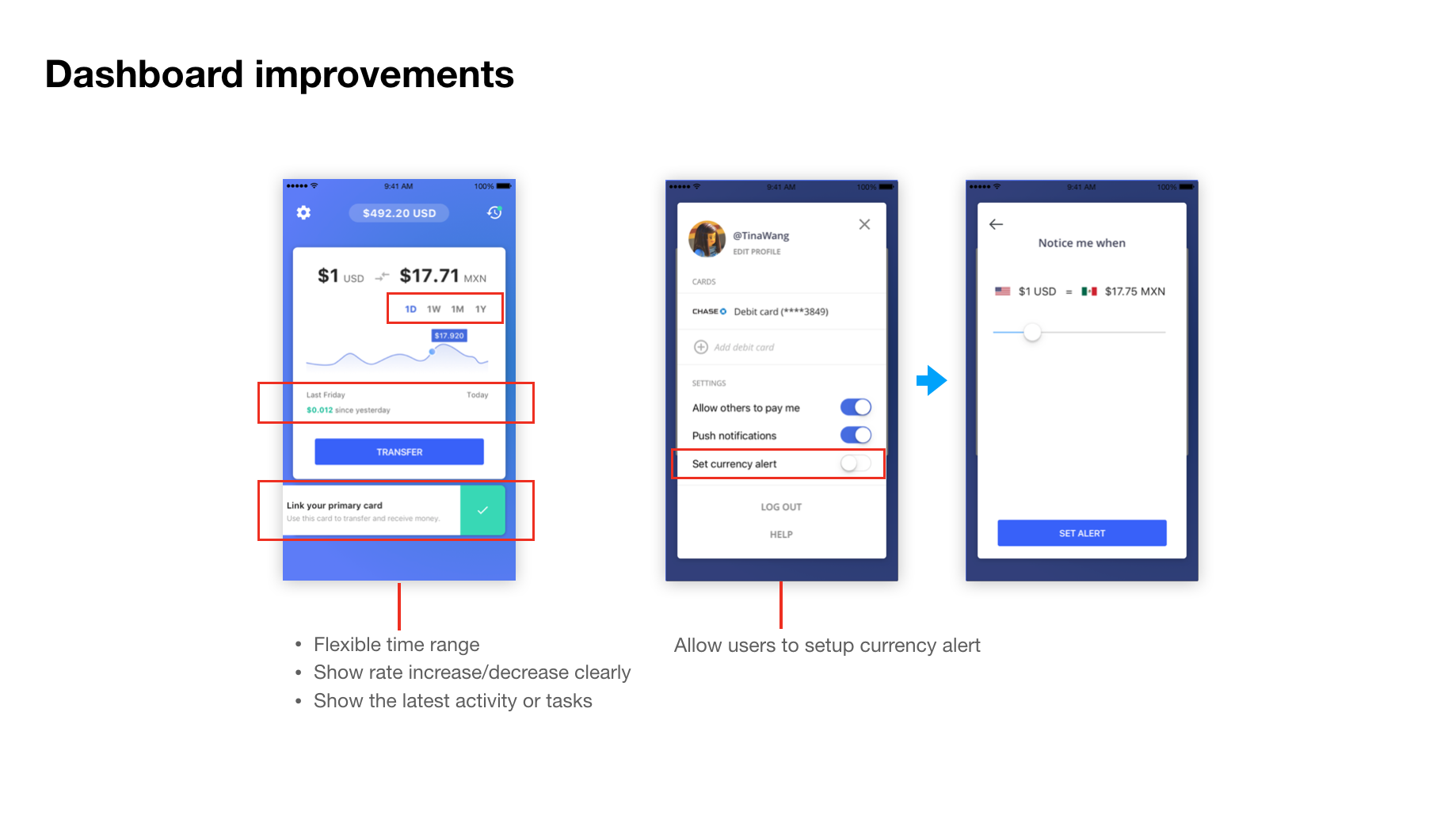
Show the latest activities. Allow users to set currency alerts easily.
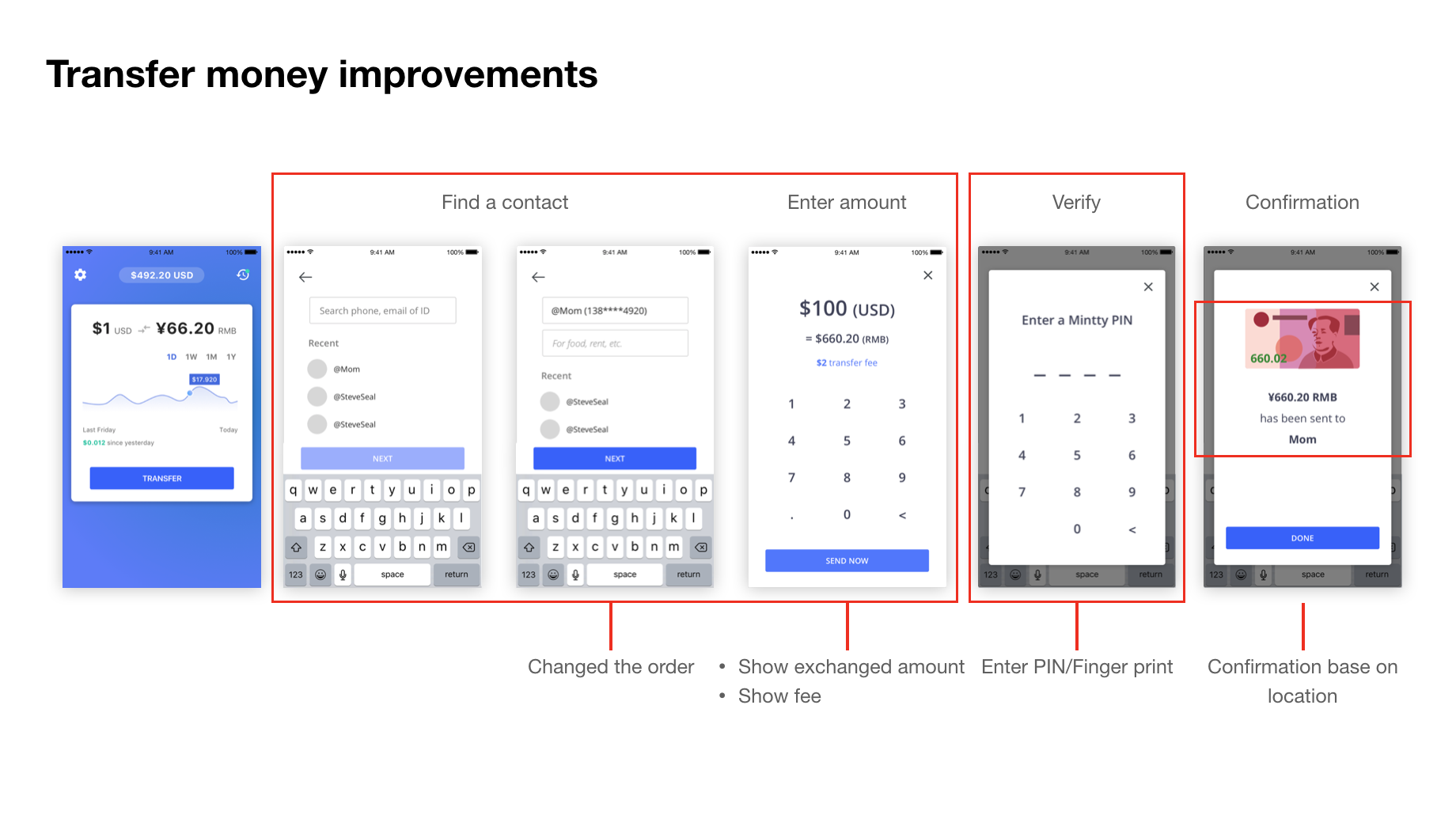
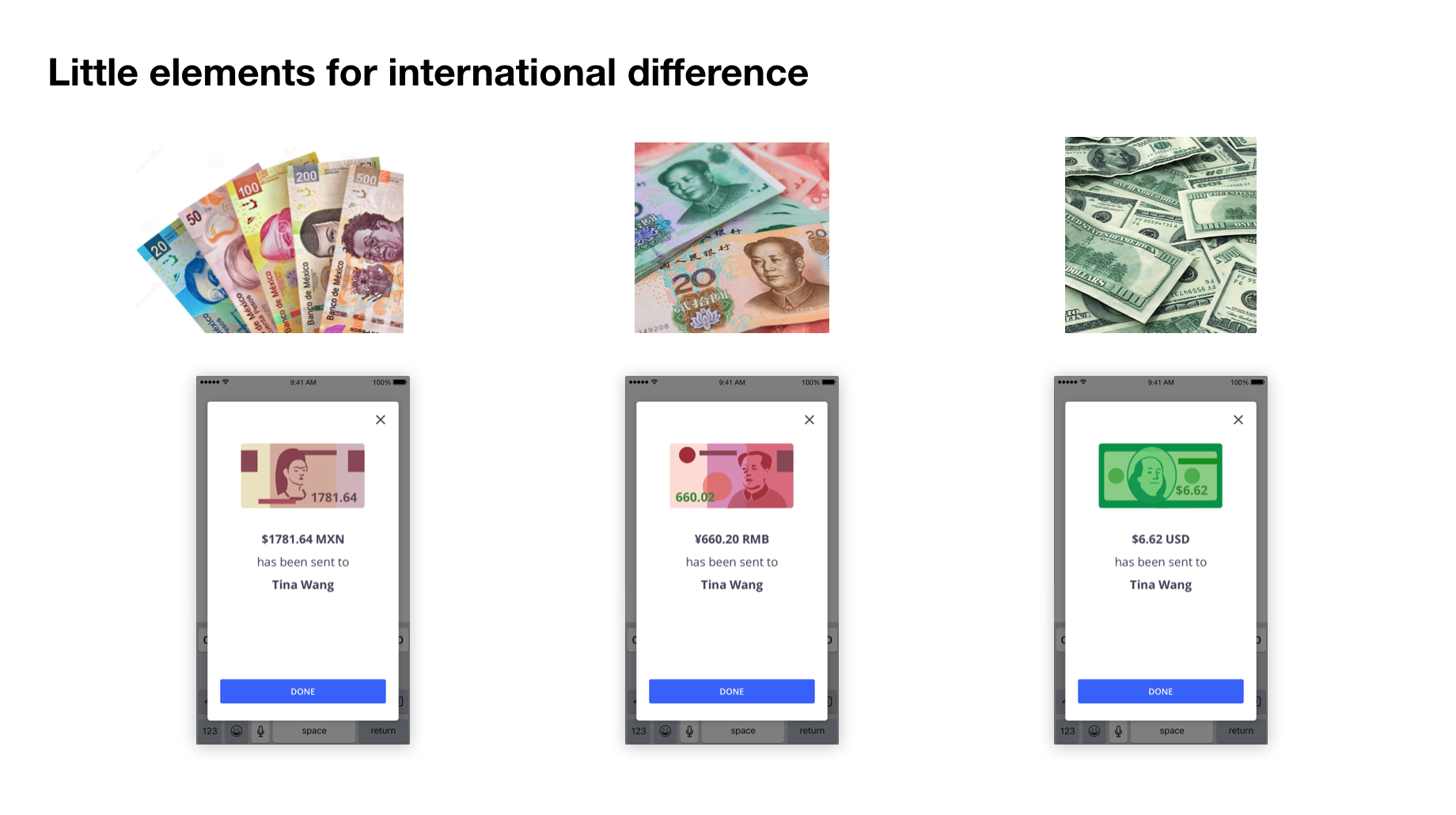
swapped the order of entering amount and finding receiver, and show real-time information to make users feel safe. Designed different UI for confirmation base on countries to bring a better experience.
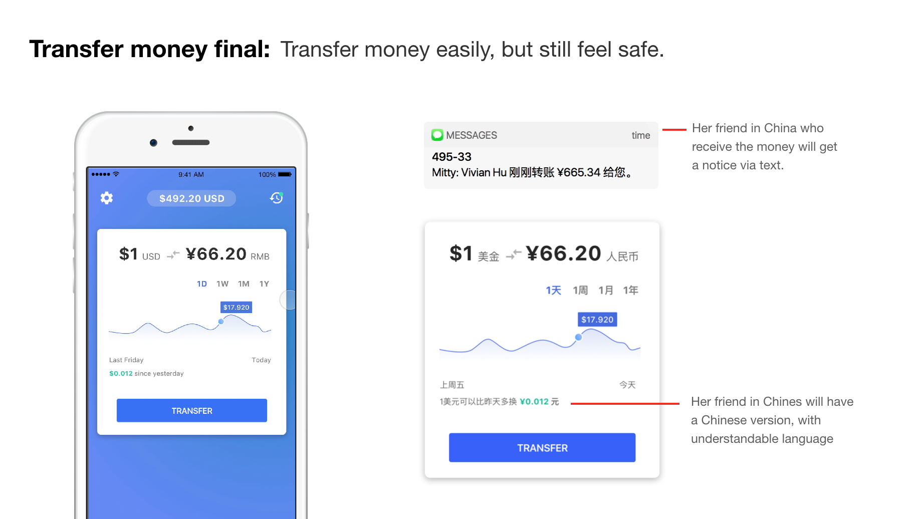
Real-time text/WeChat notification for people who send/receive the money.
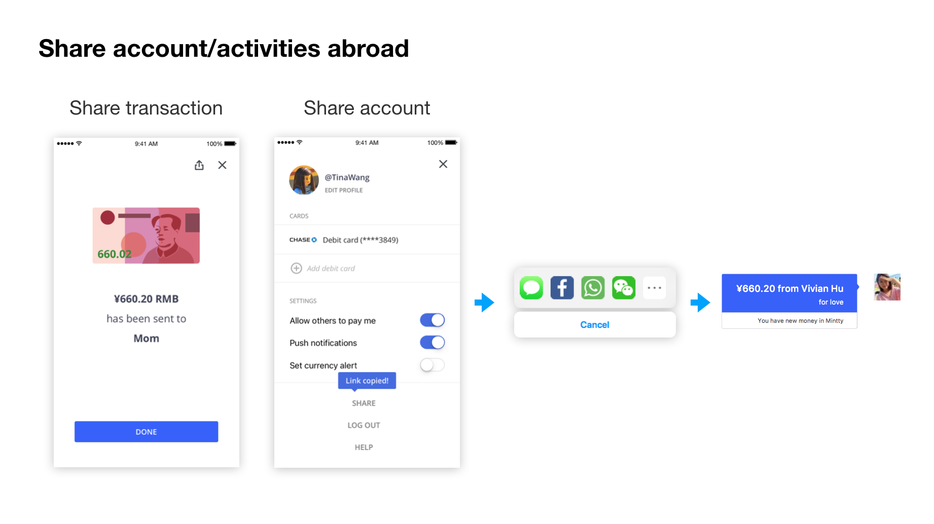
A user can share account/transfer receipt to another.
Simplify the signing up process: hide unnecessary steps, and allow users to sign up via most used accounts (WeChat, Facebook and etc). Gather the basic information during the process, and ease the money transfer process in the future.
We designed a very intuitive flow to bring a trustworthy experience to users. Help users to transfer money to the right person, with the right amount, and at the right time.
A virtual card can help users use balance online, or in a retail store or supermarket.
Encourage users to connect with each other, show love, grateful, or simply confirm that money has been transferred.