Have you ever been to a stadium, a restaurant, or a drive through McDonald's before? Have you ever thought about how cashiers order food for you? And how do they take payments? How do they talk to the kitchen? And how do they prevent stealing and waste?
It's normal if you have never paid attention to these, because you might be used to just giving your card to the cashier, and take your food - that's how normal forks usually do it. But on the other hand, Bypass is trying to solve these behind-the-scene problems. And by providing these powerful tools, Bypass is helping people get their jobs done faster and easier.
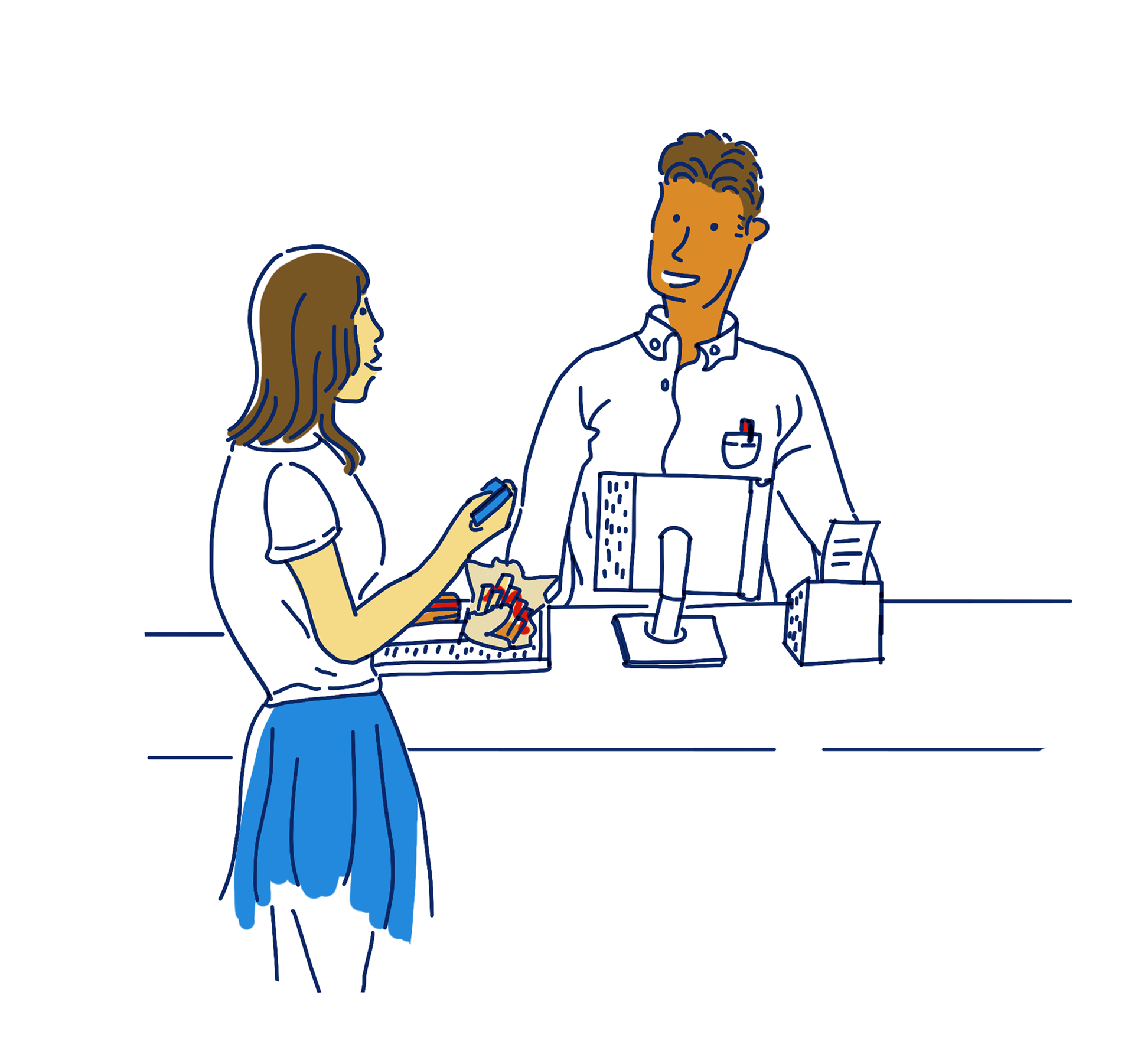
Have you ever been to a large sports stadium to watch your favorite team's season-ending game, and you ordered cheeseburger and fries at Burger king, you waited for half an hour and missed the good shot you had been waiting for a year? And when it was finally your turn, the cashier told you they only took cash but you were holding only a credit card in your hand?
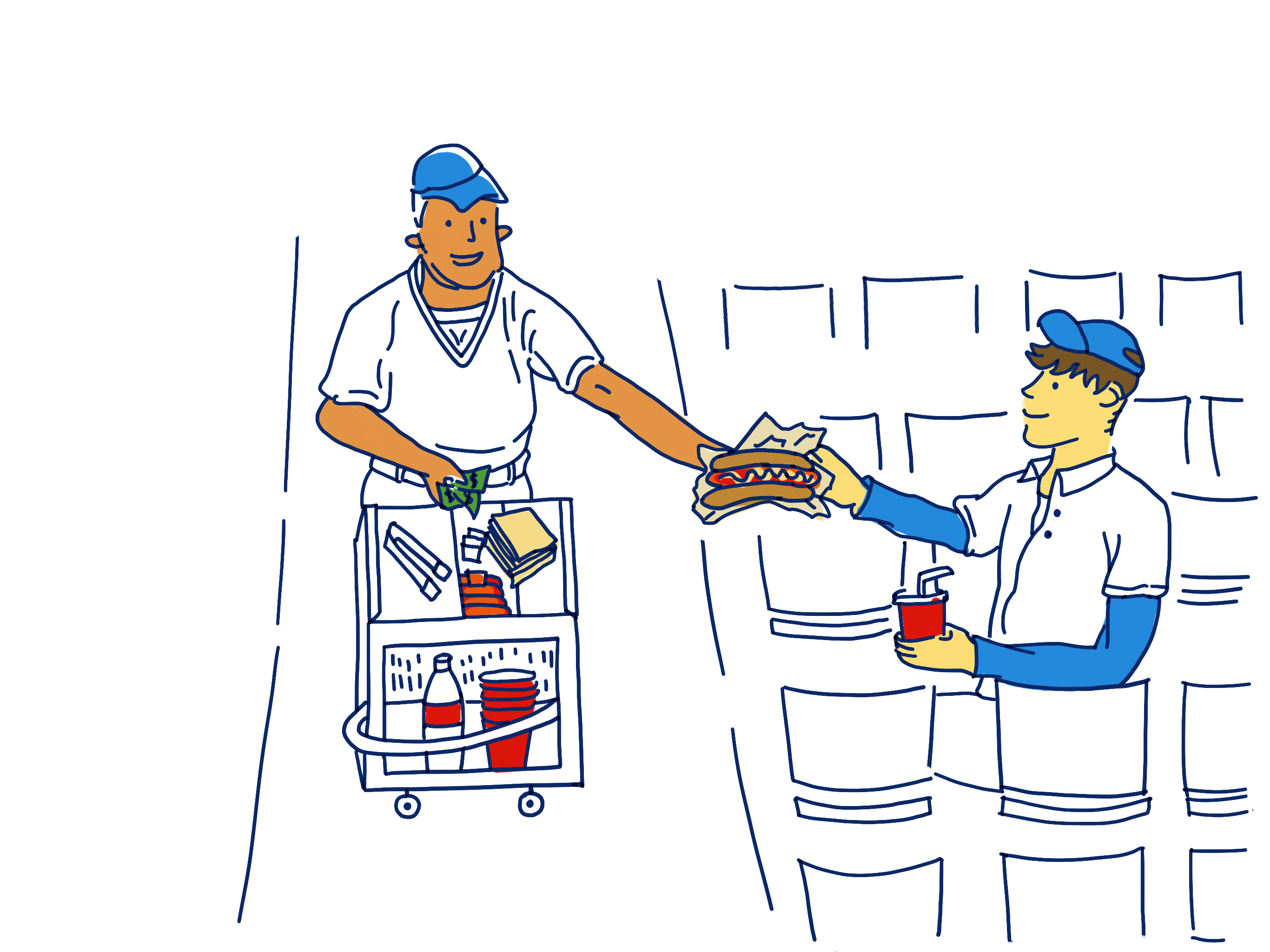
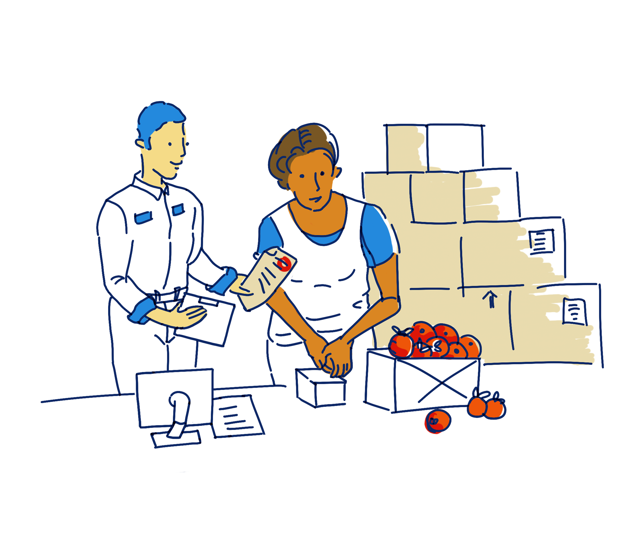
Or imagine you are a manager who works at a stadium, and there's a large event going on, maybe the Super Bowl. It's your responsibility to serve thousands of people and manage all the staffs. Specifically, you have to make sure the kitchen has enough food before the event, ingredient suppliers are delivering on time, all the tablets are running well, cashiers know how to take orders, chefs are refilling open tabs correctly. And at the end of the event, you need to make sure all sales are accurately reflected.
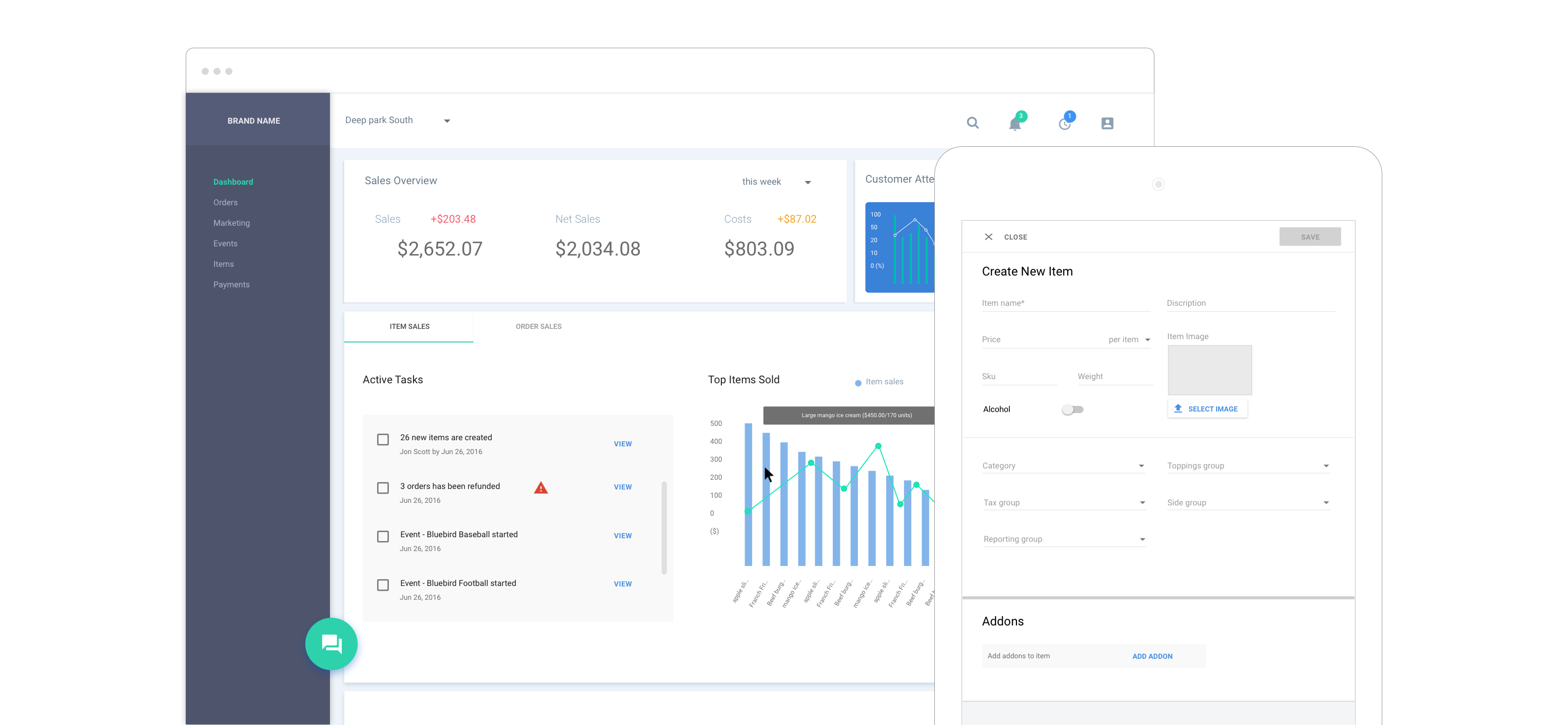
Bypass is trying to make an all-in-one system that can solve all problems from the front of house to the back of house. The end goal is to help customers, cashiers, managers, event organizers and accountants to get their job done easily.
Bypass products also asist users with generating reports and analysis data - this helps provide valuable insights into where their money goes, which items sell best, which in turn enables better decison making and higher revenue.
As a UI/UX designer at Bypass, my job is to design usable and user-friendly products that can make our users' life easier. It is challenging to design such a complicated SaaS product across multiple platforms,
especially when we also need to target different markets: fast casual, sports and entertainments, cafe, and more.
To meet all these needs, I maintain a broad view when desgining tools to help our users accomplish different goals. At the same time, I also conduct in-depth analysis of each user's unique characteristics and pinpoint their exact need. I aspire to be a contributing force in our effort to offer new, yet better solutions that will achieve overall success for our users.
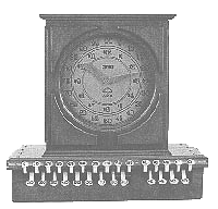
The history of POS is surprisingly long. The first cash register was invented on November 4, 1879. Even if this was almost 150 years ago, the core values that the POS devices can deliver not changed much.
The functions of the earliest models were simple: people only wanted to use them to take orders, put money in the drawer to prevent stealing and calculate sales. And for the people who are in charge of the venues and stores, they can utilize these machines to make sure sales, cost and revenue match up each other.These still remain the main goals of POS devices today.
Since the main usage of POS devices stayed more or less the same over time, some questions naturally emerge: What is it about sales today that is different from it was 150 years ago? And what are buyers' expectations of a modern POS?
The modern life is incredibly fast-paced, and there is little patience for a sluggish transaction. Consequently, it should be a priority for the service provider to get work done faster and easier than before, so that their customers can go home early to watch Lady Gaga jump from the roof in a concert. On the other hand, the implementation of automated procedures on a POS terminal can translate into lowered cost and fewer mistakes for the provider. The data that are accumulated over time can also be utilized for analytics that lead to better business decision making, such as sales prediction, inventory management and so on.
If you ever worked at a stadium, you'll know how much chaos there could be going on during an event. For cashiers who have no experience and are barely trained, it's stressful when there're 30 people waiting in line to order. And it becomes frustrating when the cashier cannot figure out the correct way to operate the POS. For staffs who work in back of house, they need to close out standsheets and run reports at the end of day. And it's easy to get upset if the system doesn't work in a proper way.
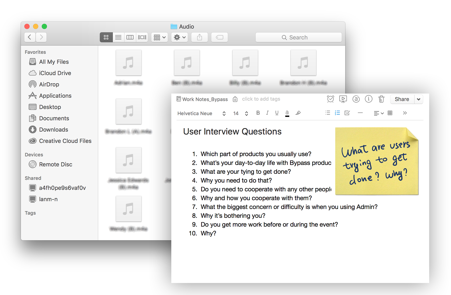
I work with my coworkers to do lots of research on the day-to-day life about our users, and design intuitive flows based on our research conclusions.
We build our hypotheses around our research, and split features into small flows, where each flow should allow users to finish a simple task quickly. We give people immediate feedback and information to help them accomplish the task on hand, and help them to learn and build a mental model about the system.
We have tried many ways to make flows "idiotproof", and design the product in a balanced way that is friendly for both new users and experienced users.
I divide the process into simple steps here to help you understand how we designed the user journey and its seamless flows.
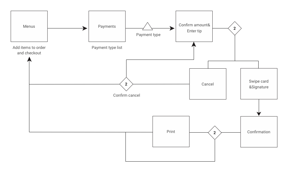
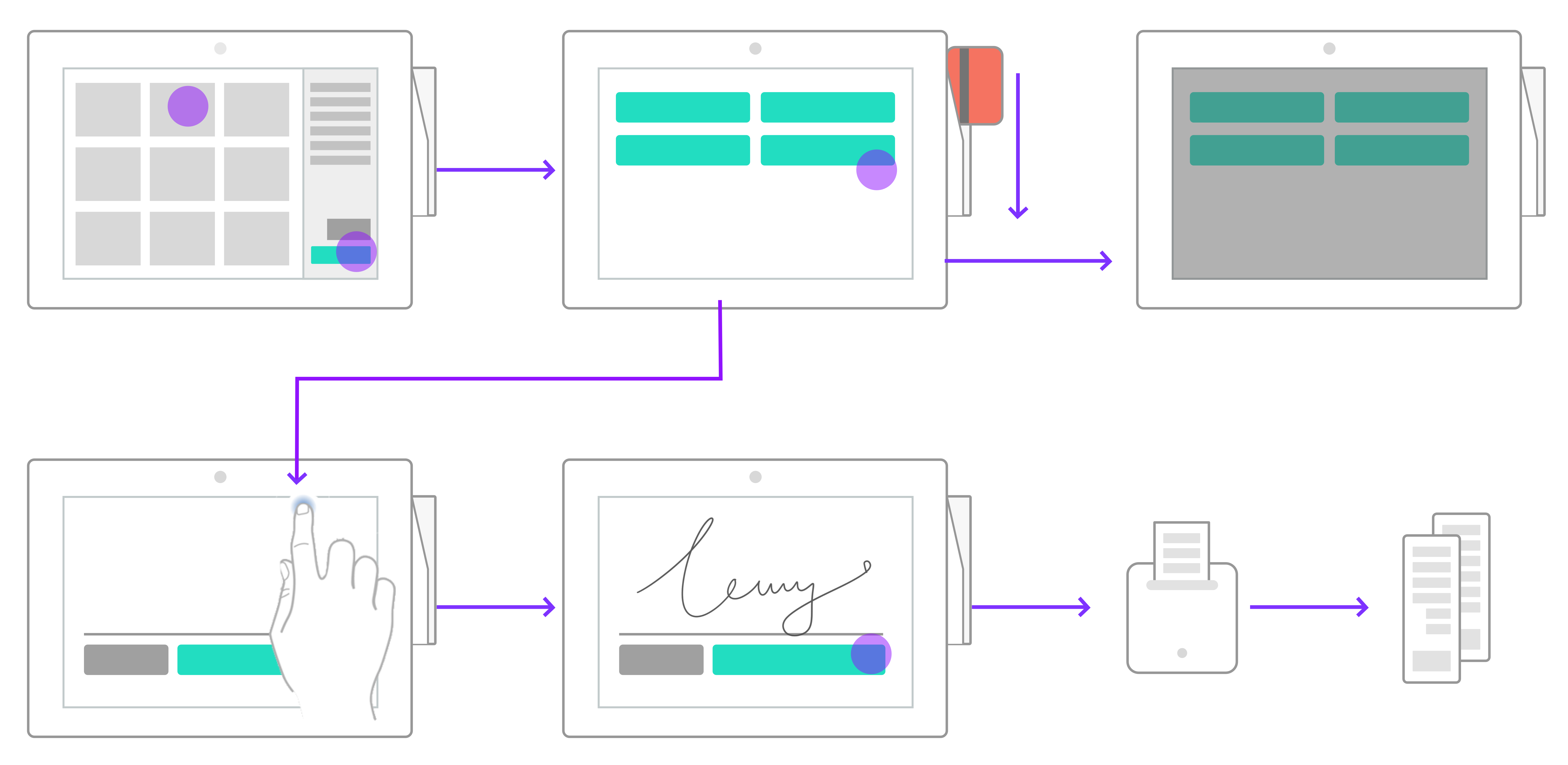
To help users to discover and learn how to use the product, designing usable interfaces is a very important key. Interfaces should be visible, understandable, logical, consistent and predictable. My job is to design interfaces that allow users to find everything they want, and do what they expect the product to do.
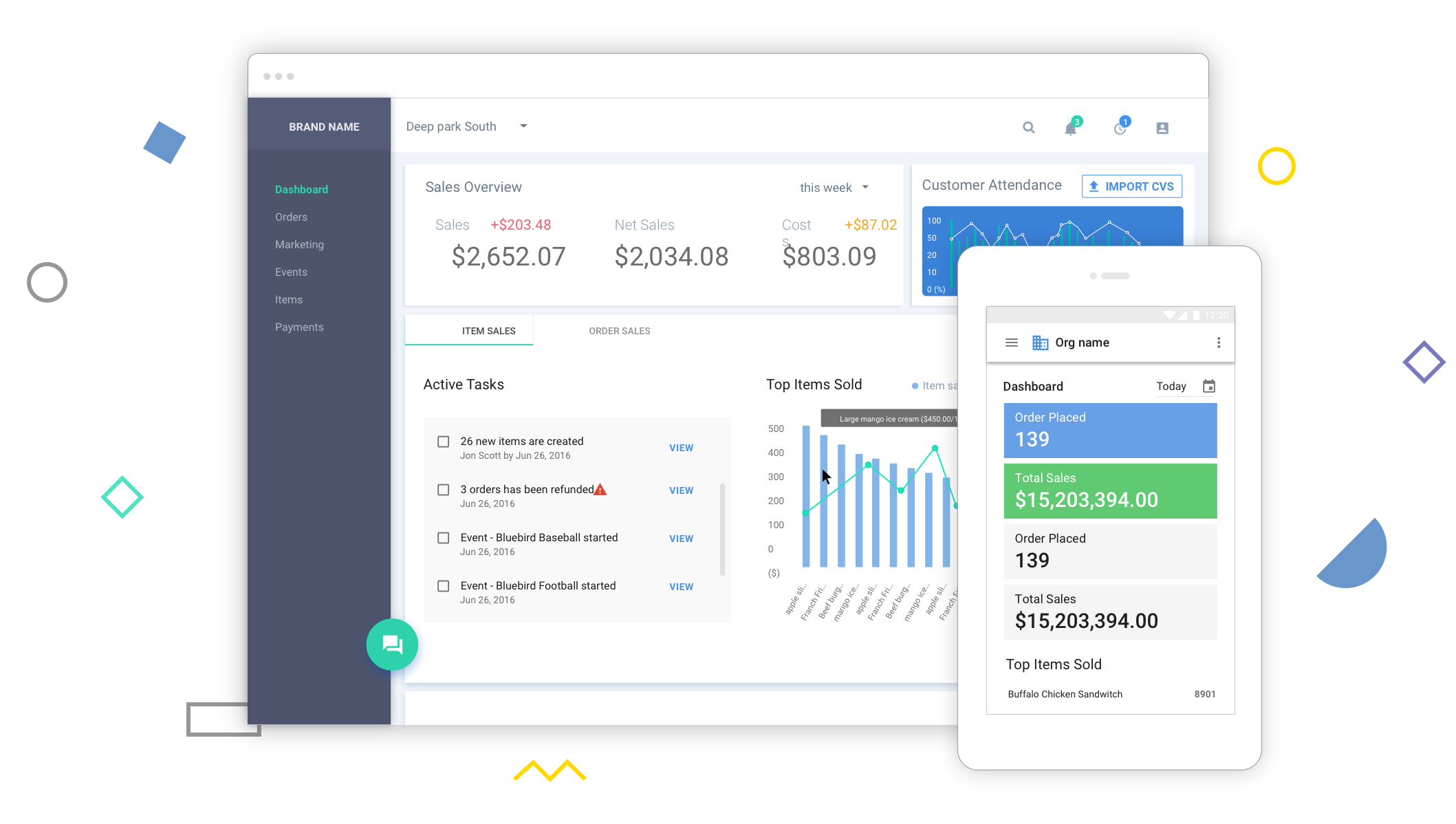
To help users to discover and learn about the complex product, I design interfaces that provide context and information in proper ways.
I designed logical and understandable interfaces for the users that already know how things work in the game and entertainment industry. Users can see, and understand what the interfaces are for. My design helps them to develop a better mental model about the process.
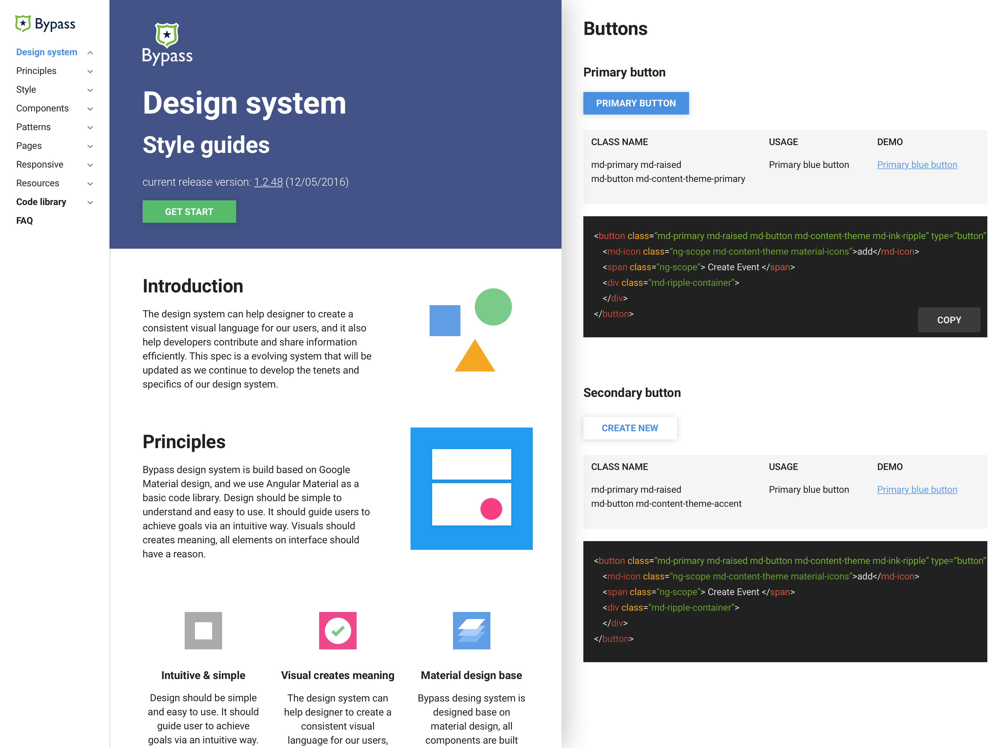
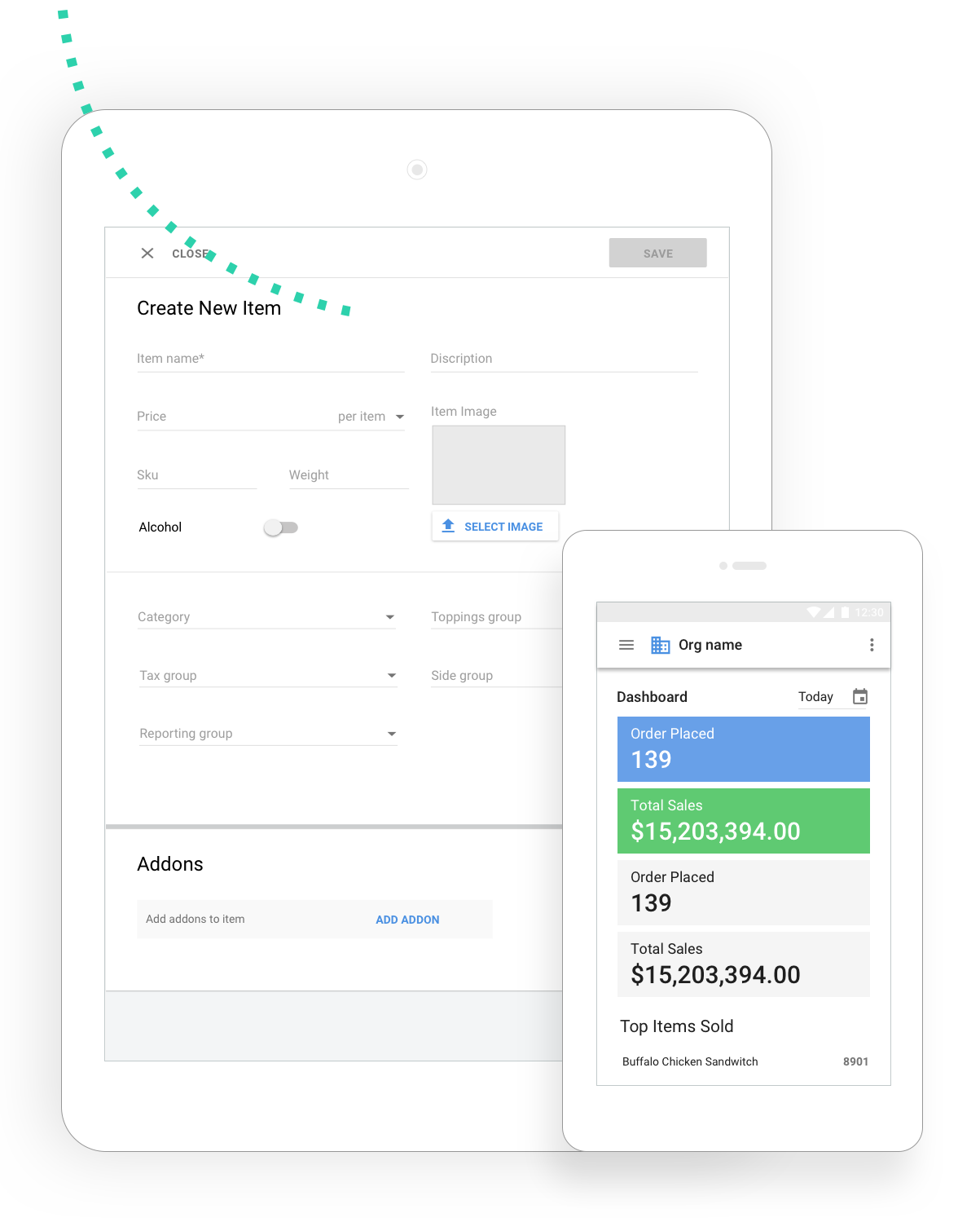
I build a design library with my front-end buddies to keep interactions, look and feel consistent across the board. Using a design library is a super effcient way to communicate with developers and hand off my designs.
*Read more about how I build design library here How To Get A Head Start On Design System
I design interfaces that have consistent feedback and layout across multiple platforms. Users can easily predict what will happen if they execute an action.

The next step is building my designs and launching it to real users. In Lean startup, Eric Ries talks about the Build, Measure, Learnloop, and how does it help companies to build mvp products with lower costs and less time. After I get the hypotheses part done, the next step is to hand off all the designs to developers, have them built out and let real users test them.
As I mentioned in the last paragraph, I cooperate with my front-end buddies to build a live design library we called "Playground" with all components implemented. I also document components, interactions, principles and use the document as an internal tool for designers and QAs. When I deliver designs to developers, I'll hand off a document with simple wireframes & component names, and link these names to code resources in "Playground". I also attach high fidelity designs with the same name, to allow product QAs to test the delivery from developers.
The last step is launching the product to real users, providing training, and gathering feedback and real data from them. Then we'll learn from our users, and improve our products.